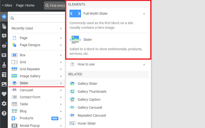
The Sliders are popular as they allow you to display data as slides, switching them in one place with effects. It saves space and adds interaction to websites. There are two types of sliders: the Full-Width Block Slider and the Slider Element.
The Full-Width Block Slider is often used as the first Block of a website containing a hero image, the main statement, and the call-to-action button. It is mobile-friendly automatically.
Add Block Slider
Add the Full-Width Block Slider from the Slider section on the Add Panel.
You can also use the Full-Width Slider Presets.
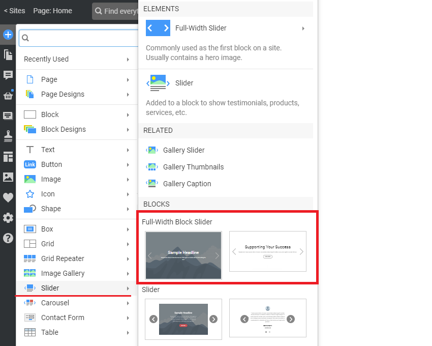
Choose the Presets and Designs for the Full-Width Slider from the corresponding lists.
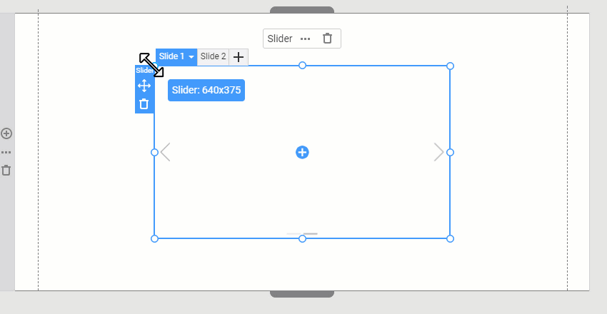
Full-Width Slider In Page Navigator
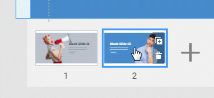
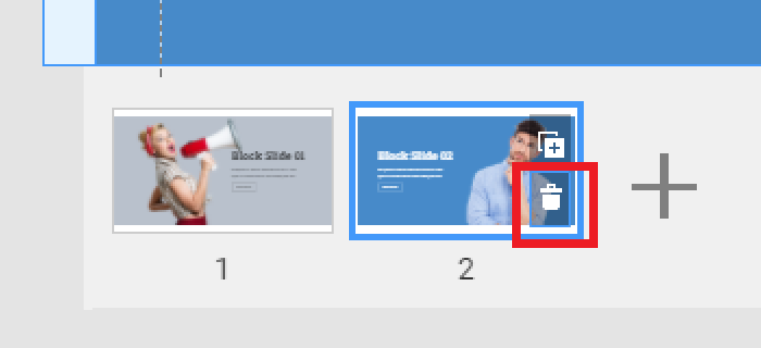
You see the Slide Thumbnails of the Full-Width Block Slider in the Page Navigator, making it easier to add, select, and move the Slides.

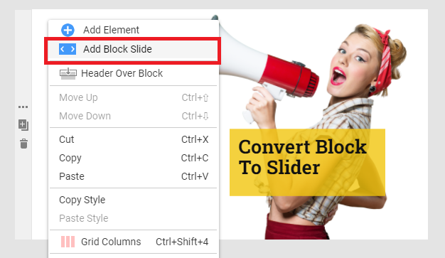
Convert A Block To Block Slider
Convert any Block to the Block Slider by selecting any Preset or Design from the Add Panel -> Add Block Slider section.
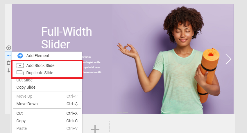
The Add Block Slider option is available if you click the Options icon on the Context Toolbar or select it from the Right-Click Context Menu.
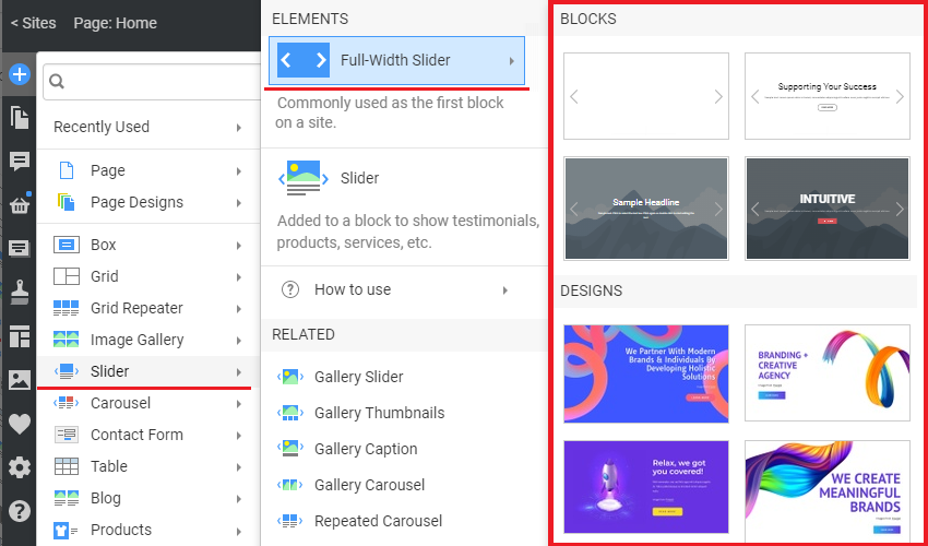
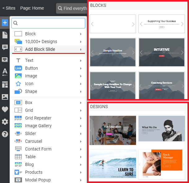
Block Slider Presets and Designs
You can start by choosing the Block Slider Presets or designer-made Block Sliders from the Add Panel.
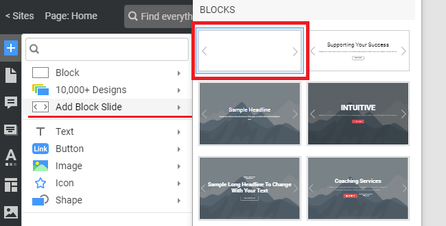
Add Empty Block Slider
You can add an empty Block Slider by selecting the first Preset in the Add Block Slider section of the Add Panel.
Block Slide Operations
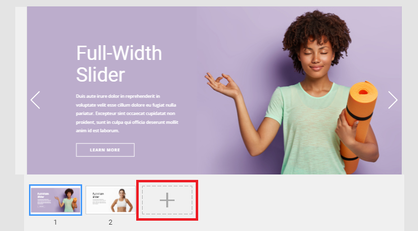
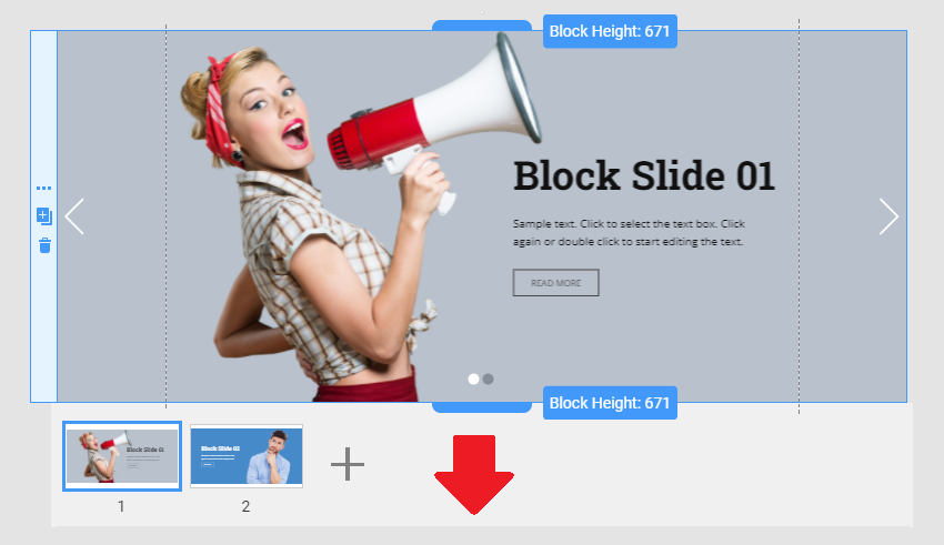
Add New Block Slide
You can add a new Slide to the Block Slider by clicking the gray Plus icon in the Thumbnails Pane under the Block Slider.
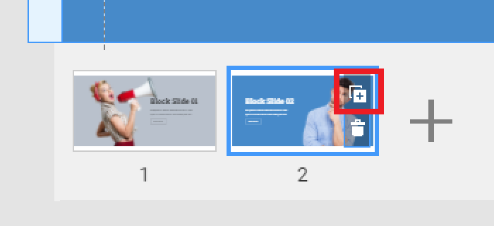
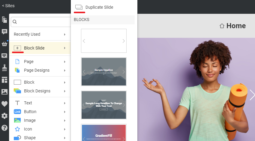
Duplicate Block Slide
You can duplicate your current Block Slide by pressing Ctrl + D or clicking the Duplicate icon on the Block Slide Thumbnail.
Use the Add and Duplicate icons for the Full-Width Block Slider in the Add Panel.
You can find the same icons in the Options menus in the Block Sidebar and Context Toolbar.
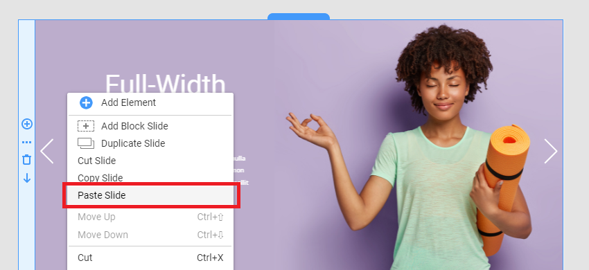
Paste Block as Slide
You can also paste any copied Block as a Block Slide.
Move Block Slide
Move the Block Slide by clicking and dragging to the desired position in the sliding sequence on the Thumbnails Pane.
Delete Block Slide
You can delete the Block Slider by clicking the Trash Can icon on the Slide Thumbnail.
Change Block Slide Height
You can drag the Block Markers on the top and bottom of the Block Slide to change its Height, similar to the Block Element.
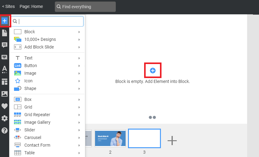
Add Elements To Block Slide
Like the Block, click on the blue Plus icon at the center to add or insert new Elements from the Add Panel. You can insert any Element, and each Block Slide can have different combinations of Elements.
Active Block Slide
Select the Block Slider and customize the Settings for the Active Block in the Active Slide section.
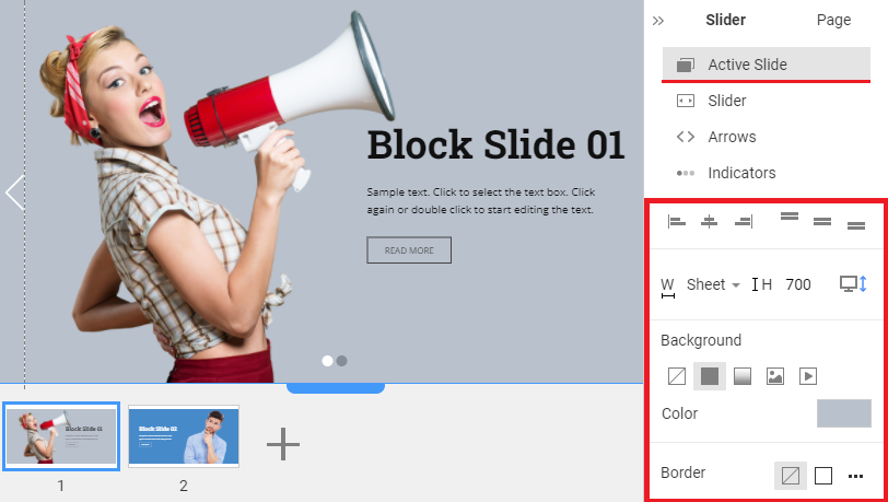
Slide Height and Content Width
You can switch the Slide content width from Sheet to Screen to set the desired Wide / Boxed layout for Slider content. To change the Block Slide's Height, enter the value in the corresponding field in the Property Panel.
Slide Background
Select the Background for the Block Slider. Like the Block, you can choose the No Color, Color, Gradient, Image, or Video option for the Block Slider Background.
Slide Border
Add the Border to the Block Slide, or set the Custom Border by choosing the side where the Border is visible. You can also select the Color and adjust the width of your Border.
Slide Parallax
Apply the Parallax effect to the Block Slide by clicking the corresponding checkbox in the Property Panel.
NOTE: The Parallax only works for the Background Image.
Slide Hyperlink
Enable the Hyperlink to the Block Slide by checking the Hyperlink checkbox in the Property Panel. You can link it to a Page, Block Anchor, File, Phone number, Email, Modal Popup, or Post.
Block Slider Animation
The Slider section for the Block Slide in the Property Panel allows you to adjust the Animation.
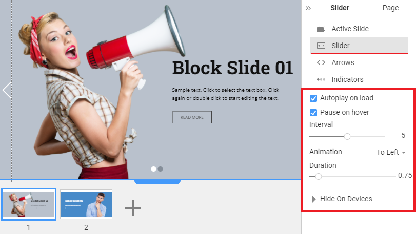
Animation Actions
You can enable or disable Autoplay on Load and Pause on the Hover action.
The Autoplay On Load immediately starts the Block sliding when the website is displayed, and the Pause On Hover stops when you hover the cursor over the Block Slider.
Animation Interval
Set the Interval between the Block sliding.
Animation Direction
You can select the Animation direction for the Block Slider, including Left To Right, Right To Left, Down, Up, or Fade.
Animation Duration
Set the Duration for the Animation sequence while switching Block Slides between each other.
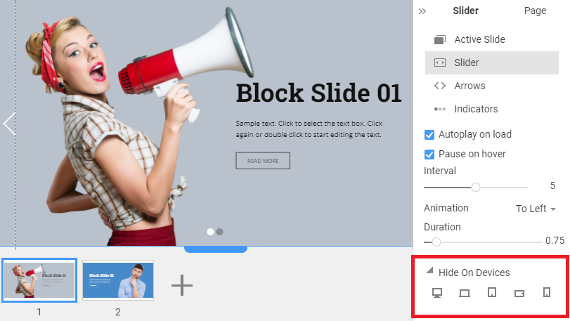
Block Slider Hide On Device
You can select the Mobile Devices on which you hide the Block Slider.
Block Slider Arrows
In the Arrows section, you can customize or disable the Arrow icon for the Block Slider.
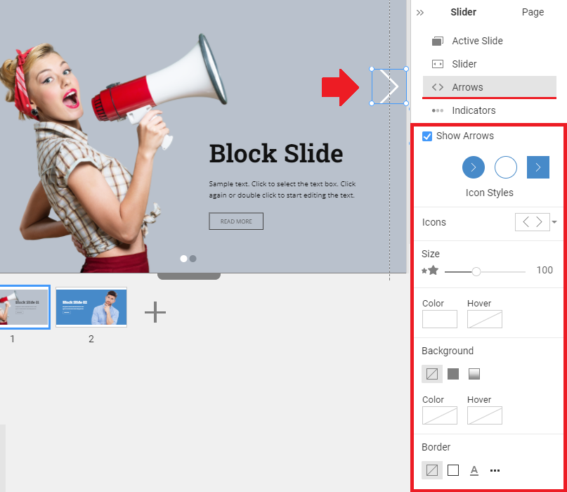
Arrow Styles
Select one of the Preset Styles for the Block Slider Arrow's Icons for the Block Slider.
Arrow Icon Sets
Pick one of the Block Slider Arrow's Icon Sets for the Block Slider.
Arrow Size
Change the Block Slider Arrow's Size by dragging the slider or entering the Size value in the Property Panel.
Arrow Color
Select the Block Slider Arrow's Color from the Basic or Additional Colors, or add a new Color with the Color Picker. You can also select the Color for the Arrow hover state.
Arrow Background
Enable the Block Slider Arrow's Background or Gradient, and select it for the Hover state.
Arrow Border
Enable the Block Slider Arrow's Border. Adjust the corners' Border Color, Width, Shape, and Radius. You can also do that for the Hover state.
Arrow Shadow
Apply Shadow to the Block Arrow Border. You can select a Shadow Preset or customize it in the Settings tab.
Block Slider Indicators
The Block Slider Indicators are displayed below and show the number of slides in the Block.
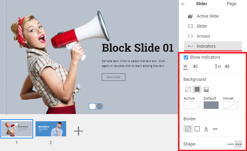
Indicator Shape
Change the Block Slider Indicator's Shape from Hyphens to Circles and vice versa.
Indicator Size
You can enter the Block Slider Indicator's Width And Height.
Indicator Background
Enable the Block Slider Indicator's Background. You can set it to Color or Gradient. You can also do that for the Hover state.
Indicator Border
Enable the Block Slider Indicator's Border. Adjust the corners' Border Color, Width, Shape, and Radius. You can also do that for the Hover state.
Block Slider in Mobile Views
You can modify the Size and Position of the Block Slider Elements for each Mobile Device.
Best Practice: Slider Expanded to Block
We notice that many users expand the Slider Element to the Block dimensions and use it as the Full-Width Block Slider.
To optimize the speed and display of the page, we now offer to convert the Slider Element to the Full-Width Block Slider by showing the Best Practice.
Please also see the essential tips on how to build responsive websites.