Izgarayı Kutulu'dan Geniş'e ve tam tersi nasıl değiştirilir
Ücretsiz Web Sitenizi Oluşturmak İçin İhtiyacınız Olan Her Şey
Kodlama olmadan web siteleri tasarlamak ve oluşturmak için Web Sitesi Oluşturucumuzu kullanın. İstediğiniz herhangi bir şeyi istediğiniz yere sürükleyip bırakın. Web Sitesi Oluşturucu, web sitenizi mobil uyumlu hale getirmek için otomatik olarak uyarlar. 9000'den fazla özelleştirilebilir web sitesi şablonu arasından seçim yapın.
İlgili Özellikler
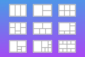
ızgara öğesi ile Ücretsiz Şablonlar
Her işletme için harika olan en iyi şablonlarımızla başlayın. Bunları, kod gerektirmeyen güçlü ve ücretsiz web sitesi oluşturucumuzla oluşturun ve özelleştirin. Tüm şablonlar mobil uyumludur ve her cihazda mükemmel görünür.


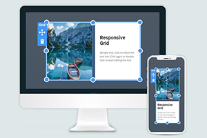
How To Change The Grid Width From Boxed To Wide
The size of the grids, space in a grid container, and the space between the grid layout content items are very important. When using grid items and modern grid layouts, you must consider the Grid's size. You must indicate the number of columns, space between them, font size of the text, etc. This feature enables you to change your grid width from box to the width. With Nicepage, you will see how easily you can transform from the min to the max container width and change the Grid from the box to the width. It is a great feature for creating grid containers to control the space between them. The grid container is to make more nice content inside the Grid. You can correct elements in rows and columns like the CSS grid layout. There is no need to use (for modifying width) media queries, CSS Grid codes, etc.
You can add some photos to the Grid and turn them into one image. You can even modify an individual grid cell or several columns. With Nicepage, you can customize your grid layout faster, and you can adjust the individual grid cell to the whole columns and rows, space between the items, remaining space, and flex items. Also, you can select the desired number of columns. To resize the Grid, you need to click resize markers. The next step is to choose margins, and you can reduce or increase your Grid as you need. Like the CCS grid, it allows you to create a different dimensional layout on the web. You can change the width of the flexbox grid columns without using different tools, and by setting one column size, you can modify the Grid's size. You will See how aspects of the offset grid columns change and how the column widths can change the layout style.
You need to select the grid layouts and apply the settings, so click on the layout and change its width. Even if the user wants to skip to the main content, it is important to control the grid container width, size of the grid items inside the Grid, place of the containers rows and columns, etc. As the CSS grid container enables you to put several items in the container and control the space between them, you can make it with Nicepage. To see how to use the number of columns automatically, accept the grid container's different files and column width and arrange them. In web development, it is common practice to sibling columns automatically, resize them, etc. So like this, you can set inside your layout one column width, with the items, and by controlling all space between them, create a unique design. It is a useful feature when users scroll down the left side of the grid changes, so it helps to create a responsive design. Setting only your one column width may not adjust to the flexbox grid column widths.