Web bloklarındaki Izgara Hücreleri nasıl yeniden boyutlandırılır
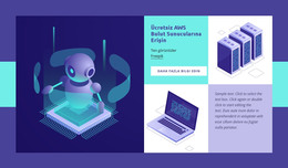
Ücretsiz Web Sitenizi Oluşturmak İçin İhtiyacınız Olan Her Şey
Kodlama olmadan web siteleri tasarlamak ve oluşturmak için Web Sitesi Oluşturucumuzu kullanın. İstediğiniz herhangi bir şeyi istediğiniz yere sürükleyip bırakın. Web Sitesi Oluşturucu, web sitenizi mobil uyumlu hale getirmek için otomatik olarak uyarlar. 9000'den fazla özelleştirilebilir web sitesi şablonu arasından seçim yapın.
İlgili Özellikler
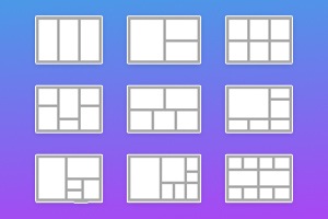
ızgara öğesi ile Ücretsiz Şablonlar
Her işletme için harika olan en iyi şablonlarımızla başlayın. Bunları, kod gerektirmeyen güçlü ve ücretsiz web sitesi oluşturucumuzla oluşturun ve özelleştirin. Tüm şablonlar mobil uyumludur ve her cihazda mükemmel görünür.


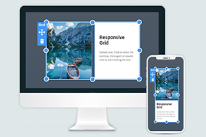
How to Resize Grid Cells In Blocks On A Web Page
The grid layout is very popular in modern web development, as it allows for the creation of symmetric websites. When you create a grid of cells, you need to control their sizes, and as may here, you couldn't allocate all required elements. Getting started with this function, you will be able to resize cells and change the element's size inside the mockup. This feature enables you to change the space between the grid rows and columns. As we know, grid columns and rows have dimensions, but we need to change them in some cases. For example, if we need to put the main content inside several blocks, we need to change the size of the cells. Sometimes the theme repeatedly recalculates the size of the grid columns when the window is resized unless it reaches a breakpoint.
To project the grid so that it's more responsive for all screens, you can choose to manually delete columns on smaller viewing screens or turn on auto-fit to create columns and rows according to the smaller screen sizes themselves automatically. When you set a width and height for your grid layout, you must consider many factors. Where you will put the first column element, content, help center item, coming soon element, and so on. When you modify a property of both the parent and one of its children, set the value first for the parent bin and then for a child bin. The grid is modeled on a 12-column mockup with varying breakpoints based on screen size. Set one column's width, and the next columns will resize around it automatically.
An auto-positioned child mesh item specifies how many columns the child item must occupy and the number of rows it should occupy. If you wish to enforce the resizing behavior that the grid layout Manager cannot support, look into managing the app's layout using grid callbacks. Setting up the properties allows you to resize the column using the width of its content, depending on the default natural width of the content. Using this feature, select the size of the site grid, where available, and see all the content on your site. If you want to enforce resizing behavior that the mesh grid layout does not maintain, consider controlling the application's layout using callbacks. When you set the size for the columns and rows inside your grid, the working process will become easier.