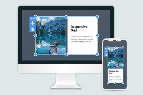
Como usar o Grid em dispositivos móveis
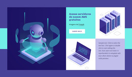
Tudo que você precisa para criar seu site gratuito
Use nosso Construtor de Sites para projetar e criar sites sem codificação. Arraste e solte o que quiser, para qualquer lugar que quiser. O Criador de sites adapta automaticamente seu site para dispositivos móveis para torná-lo responsivo. Escolha entre mais de 9.000 modelos de sites personalizáveis.
Recursos Relacionados
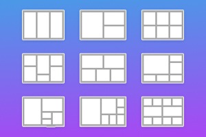
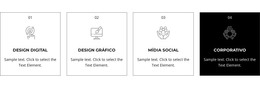
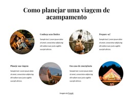
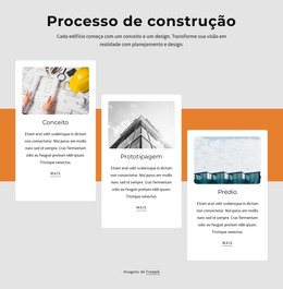
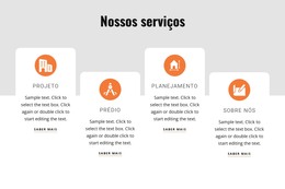
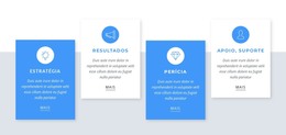
Modelos grátis com Elemento de grade
Comece com nossos melhores modelos, ótimos para qualquer negócio. Crie e personalize-os com nosso poderoso e gratuito construtor de sites sem código. Todos os modelos são compatíveis com dispositivos móveis e têm uma aparência excelente em qualquer dispositivo.


How You Can Create Responsive Web Design Using Grid Element
In modern web society, the term mobile website is outdated. Any site that wants to be popular must have a responsive web design correctly displayed on a desktop or mobile tablet. Not every mobile website builder can automatically create a website and transfer all elements and features the original had. If the designers need to make additional adjustments to build them from scratch, it can affect the consistent design and delay the start of the website.
Our mobile website builder easy can transform your webpage into a modern and beautiful mobile website using the grid system we are providing. Our grid element automatically converts elements inside the grid so that they can be reviewed in full width on different screen sizes. Thanks to the drag and drop responsive web design, images, text, animations, etc., the responsive layout has a user experience look on any platform despite the grid content width, unlike the grid system. Whether mobile display resolutions or 4K screen sizes of PCs, our best website builder can make design elements blend into each other and form a responsive web design with a lot of content in several clicks.
Now you may ask how do you create them adjust the screen size if the image or other element in the grid layout has a different resolution? This is the exact point of why our mobile website builder provides unique responsive web design to our users. We review the most important aspects of responsive web design and implement them into our drag and drop responsive web design ecosystem. Sign up in our online builder, download the version of our program you require, read the terms of service, and start creating your own custom responsive design to know what you need to do.