Jak zmodyfikować lukę dla komórek siatki
Wszystko, czego potrzebujesz, aby stworzyć darmową stronę internetową
Skorzystaj z naszego Kreatora Stron, aby projektować i tworzyć strony internetowe bez kodowania. Przeciągnij i upuść, co chcesz, w dowolne miejsce. Kreator Witryny automatycznie dostosowuje Twoją witrynę do urządzeń mobilnych, aby była responsywna. Wybieraj spośród ponad 15,000 dostosowywanych szablonów witryn internetowych.
Powiązane funkcje
Darmowe szablony z Element siatki
Zacznij od naszych najlepszych szablonów, które są idealne dla każdej firmy. Twórz i dostosowuj je za pomocą naszego potężnego i bezpłatnego kreatora stron internetowych bez kodu. Wszystkie szablony są przyjazne dla urządzeń mobilnych i świetnie wyglądają na każdym urządzeniu.


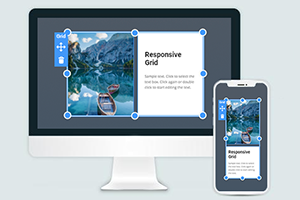
How To Customize The Gap Between Grid Cells In The Grid Container
You can modify and alter many aspects of the used CSS Grid layout to make your web design unique and beautiful. Change the CSS Grid-gap property to create more space between Grid items during this customization process. Select the Grid you want to customize, go to the Property Panel, and under the Layout section, you will find the Cell Gap slider. Move the slider to determine what gap between both columns and rows you want to display. A gap between rows or columns is an important feature that sets the attention your Grid cells will receive from visitors. So make sure to place grid items gap the way that all data and elements of your CSS grid layout module would be perfectly visible and readable.
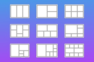
A gap between the rows or columns greatly affects the data and can align content, especially with the font size inside the CSS grid cells. See how both columns and rows will improve the overall view of the page and grid, no matter the number. Depending on the media query, the responsive layouts you build and the number of columns and space between rows and columns will affect your following properties after getting started. Make sure your Grid layout module Level 1 uses browser support to its advantage providing at least three columns, similar to the Flexbox grid columns.
No matter what number of columns your responsive layouts use and what gap size between columns you will choose, the content must be displayed to the users. Any gap between the columns must give visitors more space to explore rows and columns. Like Flexbox grid container Grid columns, the Grid you can create in our builder can vary the common space between the rows, use more than three columns if the browser support can sustain them, and manage the size between columns. The proper space between rows or columns plays an important role in the content demonstration.