Hoe de opening voor rastercellen te wijzigen
Alles wat u nodig heeft om uw gratis website te maken
Gebruik onze Website Builder om websites te ontwerpen en te maken zonder codering. Sleep alles wat je wilt, naar elke gewenste plek. De Website Creator past uw website automatisch aan voor mobiel om deze responsive te maken. Kies uit meer dan 15,000 aanpasbare websitesjablonen.
Gerelateerde functies:
Gratis sjablonen met Rasterelement
Ga aan de slag met onze beste sjablonen, ideaal voor elk bedrijf. Maak en pas ze aan met onze krachtige en gratis websitebouwer zonder code. Alle sjablonen zijn mobielvriendelijk en zien er op elk apparaat uitstekend uit.
-

-
EN

-
EN
-
-
-
EN
-
EN
-
-
EN
-
-
Gratis software voor het bouwen van websitesDownloaden
-
-
EN
-
EN
-
EN
-
EN
-
EN
-
EN
-
EN
-
EN
-
EN
-
EN
-
-
EN
-
EN
-
EN
-
EN
-
EN
-
EN
-
EN
-
EN
-
EN
-
EN
-
EN
-
EN
-
EN
-
EN
-
EN
-
-
-
-
Pas elke sjabloon aanDownloaden
-
EN
-
EN
-
EN
-
-
EN
-
EN
-
EN
-
-
EN
-


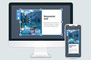
How To Customize The Gap Between Grid Cells In The Grid Container
You can modify and alter many aspects of the used CSS Grid layout to make your web design unique and beautiful. Change the CSS Grid-gap property to create more space between Grid items during this customization process. Select the Grid you want to customize, go to the Property Panel, and under the Layout section, you will find the Cell Gap slider. Move the slider to determine what gap between both columns and rows you want to display. A gap between rows or columns is an important feature that sets the attention your Grid cells will receive from visitors. So make sure to place grid items gap the way that all data and elements of your CSS grid layout module would be perfectly visible and readable.
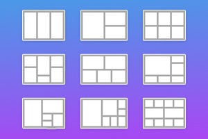
A gap between the rows or columns greatly affects the data and can align content, especially with the font size inside the CSS grid cells. See how both columns and rows will improve the overall view of the page and grid, no matter the number. Depending on the media query, the responsive layouts you build and the number of columns and space between rows and columns will affect your following properties after getting started. Make sure your Grid layout module Level 1 uses browser support to its advantage providing at least three columns, similar to the Flexbox grid columns.
No matter what number of columns your responsive layouts use and what gap size between columns you will choose, the content must be displayed to the users. Any gap between the columns must give visitors more space to explore rows and columns. Like Flexbox grid container Grid columns, the Grid you can create in our builder can vary the common space between the rows, use more than three columns if the browser support can sustain them, and manage the size between columns. The proper space between rows or columns plays an important role in the content demonstration.