Hur man använder Tabs-elementet i webbdesign
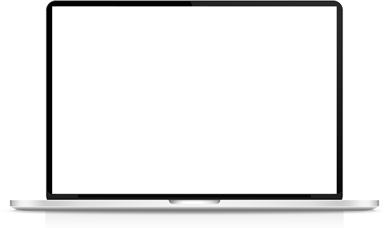

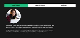
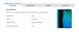
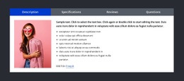
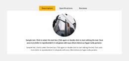
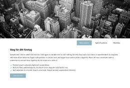
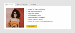
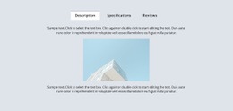
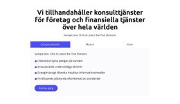
Flikar Block Designs
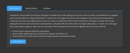
För att börja med Tabs-elementen kan du använda Tabs-designerna. Du kan hitta dem genom att klicka på snabbåtkomstpanelen -> blå plusikon för att öppna menyn Lägg till. Scrolla sedan ned till Tabs-elementet. Klicka på Tabs-elementet för att öppna panelen med förinställningar, design och element. Klicka på valfri design för att lägga till ett nytt block med Tabs-elementet.
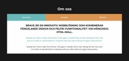
Flytta flikar
Efter att ha lagt till Tabs-elementet och innehållet i Tabs, kan du enkelt flytta flikarna i Elementet för att organisera dem på bästa sätt för dina webbdesignbehov. Klicka på fliken och sedan på vänster- eller högerpilarna på kontextverktygsfältet för att flytta flikarna på motsvarande sätt.

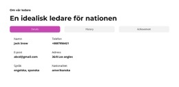
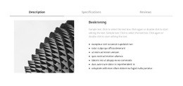
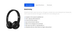
Flikar Färger
Ändra enkelt färgerna för det tillagda flikelementet, eftersom färg är nyckelfaktorn för din webbdesign. Välj Tabs-elementet i ditt block. Titta höger till fastighetspanelen. Klicka på länken för avsnittet Färger för att gå till färgpanelen. Redigera egenskaperna för att uppnå önskat utseende för ditt Tabs-element.
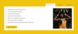
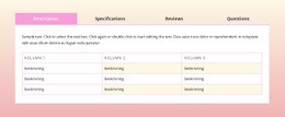
Tabbavstånd i Tabs Element
Du kan ändra justeringen och avståndet mellan objekt, topp-botten och vänster-höger för flikar. Välj Tabs-elementet, gå till egenskapspanelen och klicka på länken mellanrum. I den öppnade panelen ändrar du motsvarande Psacing-egenskaper för att uppnå bästa resultat för din webbdesign.

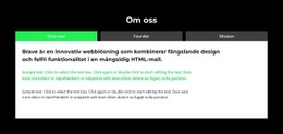
Gratis mallar med Tabs Element
Kom igång med våra bästa mallar, perfekta för alla företag. Skapa och anpassa dem med vår kraftfulla och gratis webbplatsbyggare utan kod. Alla mallar är mobilvänliga och ser utmärkta ut på alla enheter.


How To Use Tabs Element In Website and Page Builder
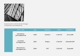
Use the Tabs to define multiple groups of elements placed in the same tab area and see how they will change the look to the template. Element tabs consist of a group of elements displayed for the selected tab. Add new tabs and control their colors, texts, and spacing. You can duplicate tabs elements, and you will have identical items.
The whole tabs element is added with added elements, but if you need to add a tab in the added element, just use the gray plus sign next to the tabs, which adds a tab element. The active tab is not focusing much on the color of the text as well as the background. Tabs allow easy navigation on the page, and visitors can easily skip to content. Use tabs and create a wonderful image gallery for your page. You can put your Google Map element in the tab and make it look nice for users. Adding a help center to your website is in trend, so our editor allows you to add a stylish help center button. It also applies to the progress bar. The tabs element allows displaying a large amount of information in a small area. Don't worry about how many tabs you need to create for your website. The element will satisfy you.
Like the drag and drop builder, our tool allows stylizing the border for tabs element borders and tab rows with properties in the property panel. Similar to the page tabs builder elements, our instrument elements are also editable, and they allow us to set the background for the Tabs and Tab Row. Specify the tab alignment in the spacing section of the property panel for the tab element. Also, you can set spacing for all tabs in the spacing section in the property panel. To change tabs elements, please enter the class element, and change the design. Tabs allow you to add the content area and here put Page Builder elements.
To add a new tab button, open the search bar and find the tab element. The stylish tabs element is perfect for controlling every element style, like the row tabs background color, row border size, etc. With a text editor, you can edit the content and replace multimedia files easily. Some websites need such elements and functions, like add to cart function, submit a ticket button, icon box, social share element, google maps elements, contact form 7, etc. So, tabs will help to stylize them to your taste.