Hur man använder tabellblocksdesignerna
Everything You Need To Create Your Free Website
Använd vår webbplatsbyggare för att designa och skapa webbplatser utan kodning. Dra och släpp vad du vill, till vilken plats du vill. Webbplatsskaparen anpassar automatiskt din webbplats för mobilen för att göra den lyhörd. Välj bland mer än 15,000 anpassningsbara webbplatsmallar.
Related Features

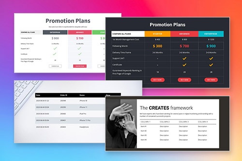
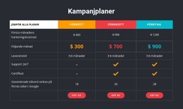
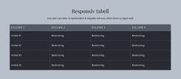
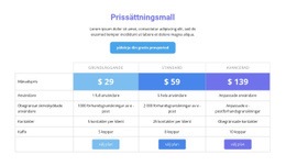
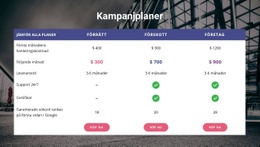
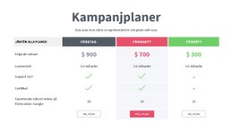
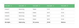
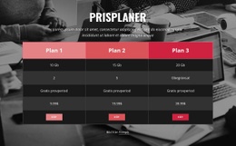
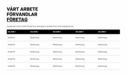
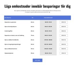
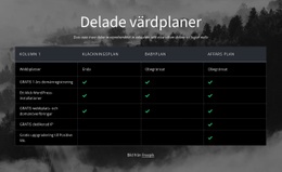
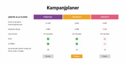
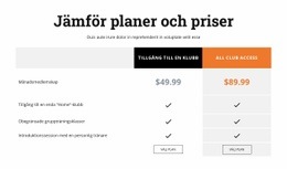
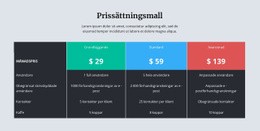
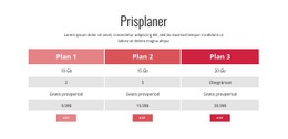
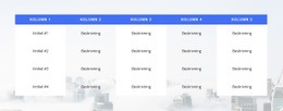
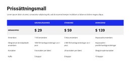
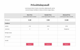
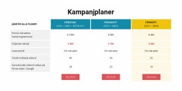
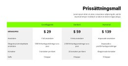
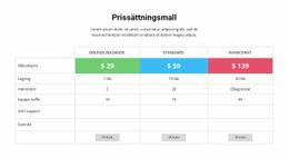
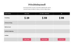
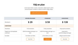
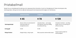
Gratis mallar med Bordselement
Kom igång med våra bästa mallar, perfekta för alla företag. Skapa och anpassa dem med vår kraftfulla och gratis webbplatsbyggare utan kod. Alla mallar är mobilvänliga och ser utmärkta ut på alla enheter.


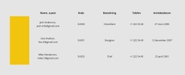
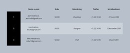

How To Use The Predesigned Blocks For The Table Element
Tables are a very usable function of a website, and in modern web design, they are frequently used. You can also start with the Table element easily. And you can use the designer-made blocks containing the Table element. For that, click on the Add icon in the Quick Access Bar, go down to the Table section, select the Table, and any Table design in the opened panel. You can control the tables on your page from the table design panel, defending your needs.
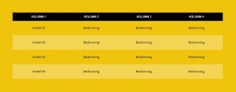
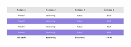
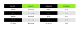
You can manage your images, text, links, and more in rows and columns with cells. To create tables with rows and columns, read the following example. The following example adds multiple columns to your table row and table cells. Some table environment contains spanning multiple columns. Most basic table markup design tends to Skip the main content. To create responsive tables up, you should maintain space between rows. Responsive tables allow tables to make a simple table environment. A simple table in LaTeX uses a table row within the table environment.
The meaning of assistive technologies is in the first Table. Most assistive technology users will learn how to create a table using a double Vertical Line. To create a simple table spanning multiple rows or columns with Vertical Line. The responsive tables use rows with individual cells to maintain space between multiple rows within a column separator. Assistive technology, screen readers ensure, can be used in table rows within a builder. This lets users with screen readers color table rows. Tables spanning multiple rows or columns.