Как изменить столбцы и строки для элемента Grid Repeater
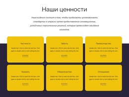
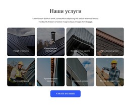
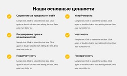
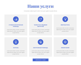
Все, что вам нужно для создания бесплатного веб-сайта
Используйте наш Конструктор веб-сайтов для проектирования и создания веб-сайтов без программирования. Перетащите все, что хотите, в любое место. Создатель веб-сайта автоматически адаптирует ваш веб-сайт для мобильных устройств, чтобы сделать его адаптивным. Выбирайте из более чем 15,000 настраиваемых шаблонов веб-сайтов.
Связанные функции
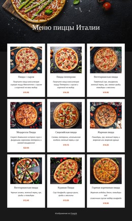
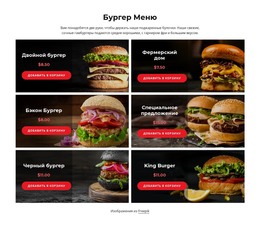
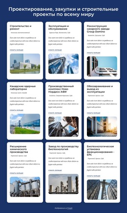
Бесплатные шаблоны с Элемент повторителя сетки
Начните работу с нашими лучшими шаблонами, которые отлично подходят для любого бизнеса. Создавайте и настраивайте их с помощью нашего мощного и бесплатного конструктора веб-сайтов без кода. Все шаблоны оптимизированы для мобильных устройств и отлично смотрятся на любом устройстве.


How To Modify The Rows And Columns Properties For Grid Repeater Element
Our page builder uses the Grid system that allows the creation of a responsive design for the Grid layout on your page using the best practices of the Grids. Adjust the Grid layout web design on your web page using rows and columns. In our Property Panel, you can use smooth sliders to regulate the number of rows and columns, quickly adding or removing them. Using the Item Gap slider, you can customize the grid layout space between columns and rows so that the one column and row would be at an equivalent distance from one another. You can build your web design without a drag and drop editor or different types of grids using simple yet effective best practices.
Web designers usually wonder how to create a responsive grid and build grid systems that laconically combine the most important content of text and images? Using main types of grids like a modular grid or hierarchical grid, you can integrate more than 12 columns per page by changing their positioning in the grid system. The modular grid has a strict space between the gutters, but this plays as a plus for the responsive design in the content area. Hierarchical grids provide a more free website design where text and images are not always a part of the same block but create an overall complete structure.
For the 12 columns maximum, the most important thing is to manage the overall space between columns and column width within the 12-column grid. Our landing page builder will answer the question of how to create unique types of grids similar to a modular grid or hierarchical grid. Our page builder will help to customize the column width in your column grid and improve the user experience on different devices and screen sizes. A good user experience will prevent users from clicking the skip to content button, especially how to build a page in the 12 column grid.