Comment utiliser l'élément Full-Width Slider dans la conception Web
Tout ce dont vous avez besoin pour créer votre site Web gratuit
Utilisez notre Website Builder pour concevoir et créer des sites Web sans codage. Faites glisser et déposez tout ce que vous voulez, où vous le souhaitez. Le créateur de site Web adapte automatiquement votre site Web pour mobile afin de le rendre réactif. Choisissez parmi plus de 9 000 modèles de sites Web personnalisables.
Fonctionnalités associées
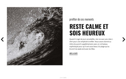
Modèles gratuits avec Élément de curseur
Commencez avec nos meilleurs modèles, parfaits pour toute entreprise. Créez et personnalisez-les avec notre créateur de site Web puissant et gratuit sans code. Tous les modèles sont adaptés aux mobiles et ont fière allure sur n'importe quel appareil.
-

-
EN

-
-
-
-
EN
-
-
-
-
-
Logiciel gratuit de création de site WebTélécharger
-
EN
-
-
-
-
EN
-
EN
-
-
-
-
-
-
-
-
-
-
-
-
-
-
-
EN
-
-


How To Create Your Free Full Width Slider Site
How to create a website, a WordPress theme or a new custom site template with your own best full width slider examples that will reflect the dynamics and your unique approach to your customers and visitors? First, you must discover how to add a full-width responsive element to build a layout with the free full-width online plugin. Quickly creating your full width slider is easy if you use our program and our site provides free download so that you can start at any moment.
After downloading, start the new site and click on the element tab, where you will find the fullwidth slider. Our best free web builder can set up your full width slider or image slider using the most relevant plugins. This builder with a full width slider using an image slider module provides multiple settings for slider design after you pick it. Set up the full width slider, and make sure to look through the settings in the right panel to customize the font size and style of the text and fit your fullwidth slider design into the overall website design. Other elements like skip to content and terms of service will be automatically placed above no matter what slide is currently on the screen. The fullwidth slider will support any resolution, whether on the phone or the latest monitor.
It is a good idea to pick several similar slides to promote the main theme with an image slider of your sites like real estate, food & restaurants, or sports. You can make a full width slider the distinguishing feature of your future websites if you discover how to add custom high-resolution images and unique fonts, which you can save as presets in your library. Tutorials with image slider module presented on our site will help you to realize the full potential of the full width slider element, as well as many others.