To build a contact form on a website, you can add and modify various file types. You can also create Multi-Step Contact Forms.
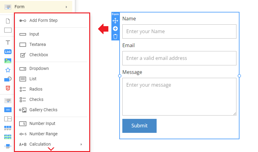
Input
The Input field is an essential field type for the Contact Form Element, generally used for collecting text data. You can switch this field type in the Property Panel.

Text Area
You can use the Text Area Field to collect long texts with several lines. Set the Rows property to specify the Number of rows for the Text Area Field, which is four by default. While typing, the users can press the Enter key.

Checkbox
Use the Checkbox Field Type to allow visitors to check in the Contact Form Element.

Dropdown
There are two types of Contact Form Selection. You can choose the Dropdown Field from the Add Panel. You can set the Default Item for the Dropdown Field.

List
Another selection type is the List Field, which you can add from the Add Panel. You can set the Default Item for the List Field.

Radios
You can add the Radios Fields to the Contact Form Element. You can also change the Radios layout to the horizontal in the Property Panel. You can set the Default Item and stylize the Radios separately from the Labels.

Checks
You can use the Checks Element to add the Checkbox List to the Contact Form. In the Property Panel, you can change the Layout to horizontal and stylize the Checkboxes separately from the Labels.

Gallery Checks Or Radios
Add the Image Gallery with checkboxes or radio buttons to the Contact Form Element. In the Property Panel, switch the type from Checks to Radios. You can edit the images in the Images section.

Number Input
You can get the Input from your site's visitors as a number, which allows you to enter the value and fine-tune it by clicking its arrows. In the Property Panel, you can switch the Layout to the Range Type.

Number Range
You can also add the Range Slider to the Contact, enabling users to provide numeric Input by dragging the Slider marker.

Names
You can use several Input Presets to add the Names. To work with the names more conveniently, use the first and last name fields for the Contact Form Element.

You can use the Email Presets to add the Input with the Email settings.

URL
You can collect users' URLs using the URL preset of the Input field in your Contact Forms.

Country
You can set the Country type based on the List field in the Contact Form Element and choose the default country in the Property Panel.

Multi-Line Address
Use the Multi-Line Address Input preset to add the Address-related fields faster.

Signature
Add the Signature Field, allowing you to request that visitors sign the provided data. The signature will be attached to the submission email.

Phone
You can add the Phone field to the Contact Form Element. In the Property Panel, select phone format presets or specify a custom pattern.
Alternatively, you can switch the Layout to show the Country Flag Icon and use the preset Country Phone Format. You can also set the Default Country. Publish or preview to test the Country selection.

Date
You can add the Date field to the Contact Form Element. Clicking the date opens the calendar on the published site or preview. Please note that the date picker does not work in Phone Modes.

Time
You can also add the Time Field to the Contact Form Element. The Current Time is the default, but you can choose different hours in the Property Panel.

Text
You can add Text and change its style to a Heading in the Contact Form Element.

Image
You can use an Image to illustrate a contact form. You can align and move Images in the Contact Form Element by dragging.

Line
You can also add and stylize a Line to separate fields in the Contact Form Element.

Rating
You can collect user feedback and votes using the Rating field added to a Contact Form.

Recaptcha
Nicepage uses Google's reCAPTCHA v3 with your Contact Form to prevent bots from submitting it. Google reCAPTCHA v3 is added automatically.