The Content Area is used for placing website content for the boxed layout. It is marked with the dashed lines in the Editor, and you can use it for the content alignment.
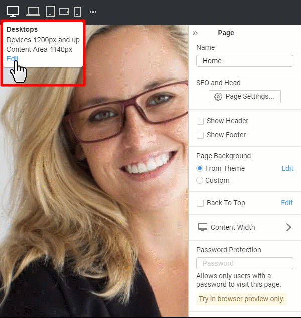
Responsive Mode Breakpoints
Please note, while editing the Content Area Width, you do not modify the Breakpoints used to switch the Responsive Mode.
NOTE: You can set the Desktop screen width to 1340 pixels. However, the Breakpoint for laptops is set to 1200 pixels. In this case, you will get a wide Content Area on screens having a width of between 1200 and 1340 pixels.
Responsive Mode Tooltip Link
You can edit the Content Area Width for each screen by clicking on the Edit link on the Responsive Mode Tooltip.
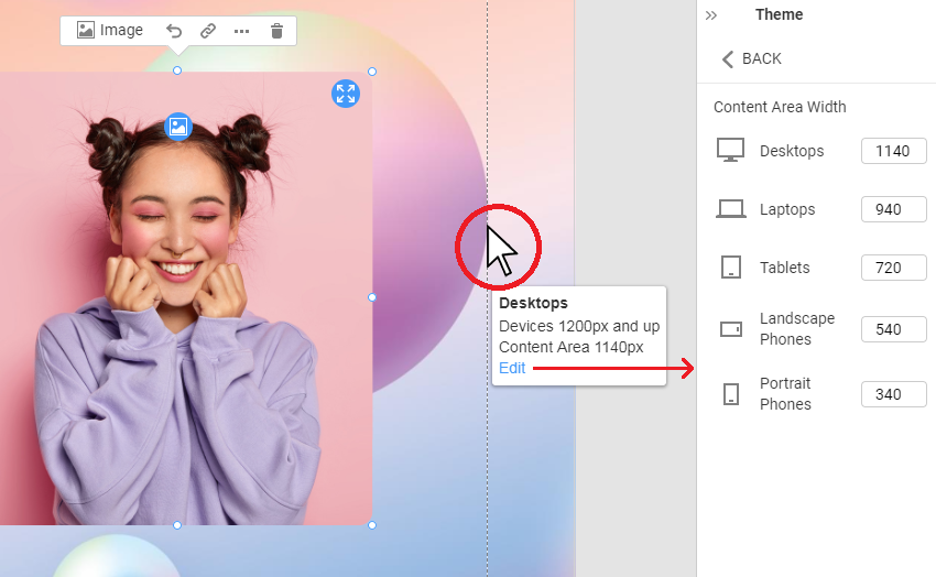
Content Area Tooltip Link
You can click on the link in the tooltip shown near the Content Area dash lines to open Content Area properties in the Property Panel.
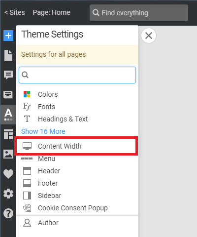
Link In Theme Settings
You can also click on the Content Width link on the Quick Access Theme Panel.
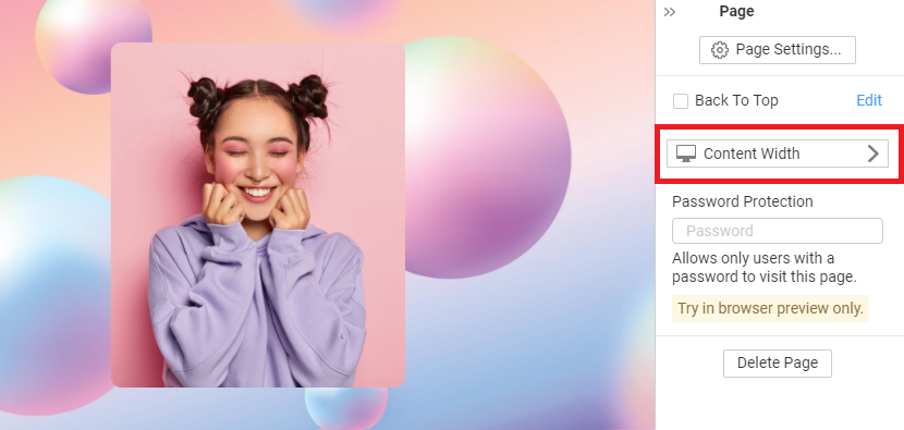
Property Panel Button
We have improved the Edit Content Area link by adding the Icon and making it more visible in the Property Panel.