The Nicepage Online Builder allows the creation of any website in minutes. Nicepage is also available for Desktop, WordPress, and Joomla 3 and 4.
The following video tutorial was made with one of the previous versions. We are updating the videos.
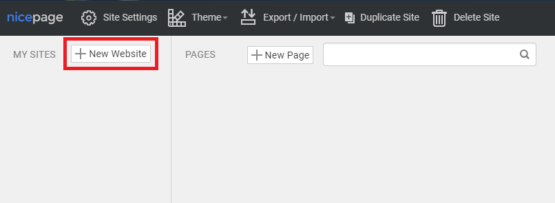
Dashboard
For convenience, you can run Online Editor in a new browser window.
- If you have opened the Editor, click on the Sites link at the top.
- On the Dashboard, you can add and manage your Websites and Pages.
- Click the New Website button to create a new site.
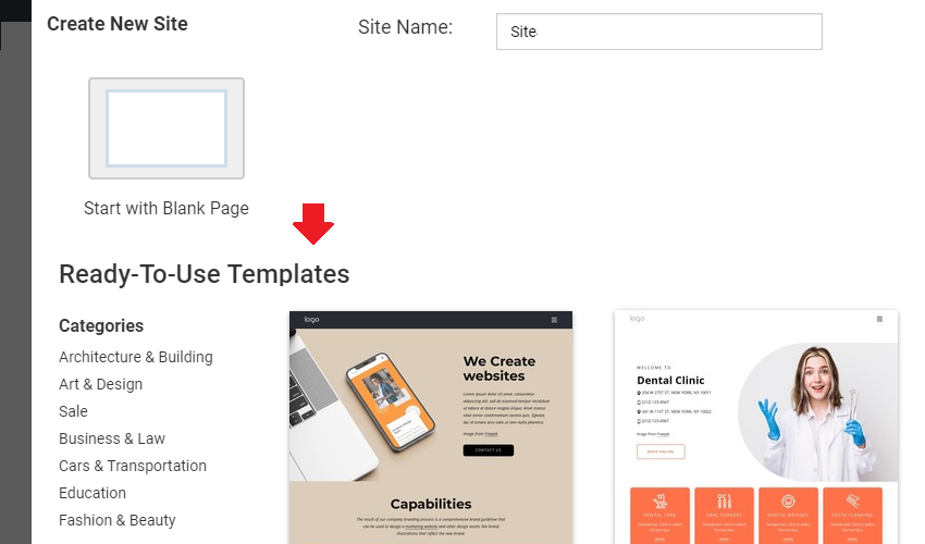
We recommend starting with the predesigned examples created by professionals. You can filter the design samples by topics, scroll through the thumbnail previews, and start with any design.
User Interface
Let's review the essential components of the Nicepage HTML Website Builder. The Nicepage's User Interface consists of the following areas.
- Top Bar
- Quick Access
- Page Navigator
- Page Editor
- Property Panel
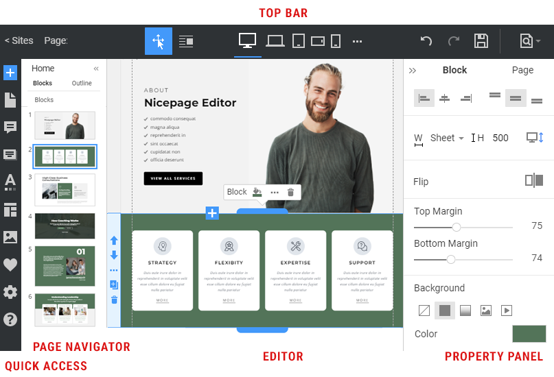
Top Bar
On the top bar, the Sites link leads to the Dashboard, the Current Page is displayed, the Find Everything Search Is Located to the left, the Editor and Responsive Modes are centered, and service icons, including Save, Preview, Publish, Export, Settings, and Profile, are positioned to the right.
Page Navigator
The Page Navigator is located to the left. It makes it easy to select and manage Blocks. You can also find the Header and Footer on all website pages here.
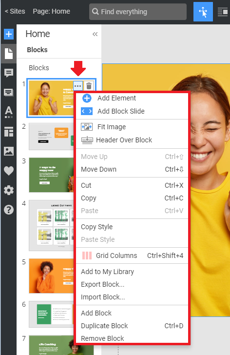
Manage Blocks
In the Page Navigator, you can quickly move Blocks, changing their order on a web page. Click on the Options icon to open a list of available operations for a block's Icon.
NOTE: You cannot move the Header and Footer.
Design Editor
In the Design Editor in the central area, you can add, move, align, and edit Blocks, Containers, and Elements.
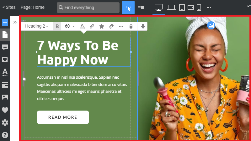
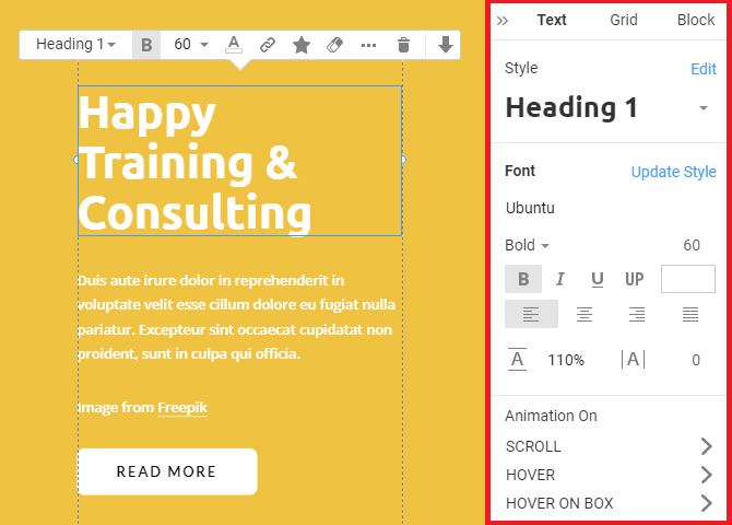
Edit Properties
Choose any Element in the Editor, and go to the Property Panel to the right to edit all supported properties. At the top of the Property Panel are Tabs, allowing you to switch between the Element, Container, and Block properties.
Theme Settings
All modern websites and themes feature global settings for Colors, Fonts, and Typography. You can edit your website project in the Theme Settings.
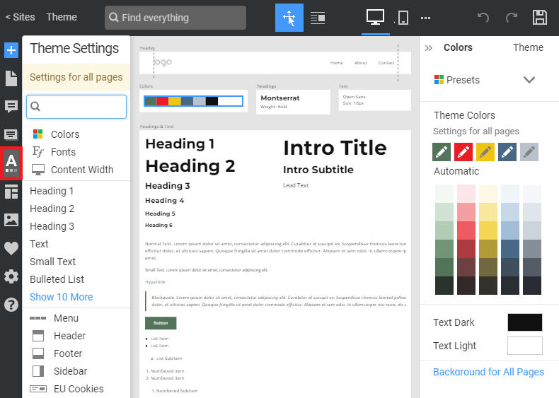
Edit Colors
Start with the Colors. In reality, most websites use only five colors. Therefore, you can use the Color Presets to apply colors to all Website Elements.
Edit Fonts
You can also use the Font Scheme. The Font combinations use the most popular Google Fonts. You can customize Font Schemes.
Headings & Text
You can stylize the Elements used on your website, including Headings, Text, Lists, Buttons, and more.
Add Panel
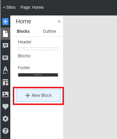
To add Blocks and Elements, click the blue Add icon on the Quick Access Pane to open the Add Panel. Start by adding Blocks to build your web design.
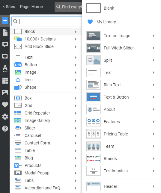
You can also click the New Block button to open the Add Panel. You can start with the Block Presets, Block Designs, or begin with the Blank Block and build from scratch.
Block Presets
You can add Block Presets, such as Text on Image, Features, Contact Form, and Map, among others. You can select Blocks by Category and Style. After adding a Block Preset, you can see its properties in the Property Panel to the right.
Block Designs
Add a New Block. Click on the 10000+ Designs link in the Add Panel. There are over a thousand predesigned Blocks, and we add more with each update.
Click on the Category link at the top of the Designs and filter the list by a Category if needed.
Blank Block
If you do not find suitable premade Blocks, you can start from scratch by adding a Blank Block.
- Click the New Block button.
- Click on the Block link in the Add Panel
- Select the Blank Block.
- Change the Height by dragging the Block markers if needed.
Use Grids
Add the Grid Element, which you can use to add Text and images.
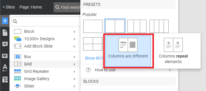
- Add a New Block.
- Click on the "Grid" link, and
- Select the Grid with Different Columns
- Resize the Grid.
- Align the Grid using the magnetic guides.
- See the Sizes in the red boxes.
Edit Grid Cells
You can select and modify the Grid Cell.
- Select a Grid Cell.
- Go to the Property Panel to the right.
- Click on the Image Background Icon to enable it for the Cell.
- Click on the Image icon and change the image for the Cell Background.
- Change the Image Fit for the Cell Background.
- Add Spacing by changing the Between Cells property.
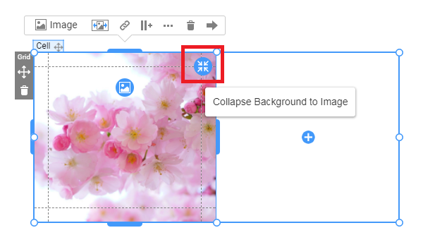
You can click on the Collapse icon to make the image part of the content, and the Expand icon to revert it to its original Image Background.
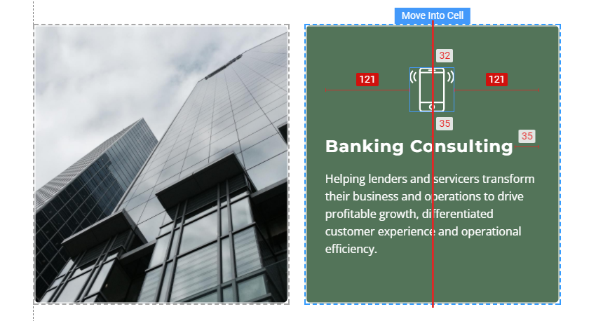
Switch Cells by clicking and dragging the Move icon on the small bar on the Cell's top. While dragging, you see the blue highlight border for the destination Cell.
To replace the Cell, drag the source Cell while holding the ALT or CTRL key. To delete an Element or an entire Cell, press the DELETE key.
Select the empty Cell. Click the Fill icon and choose the icon color for the Cell.
Add Icon
Click on the Add icon to add content to the Cell.
- Add the Icon Element.
- In the open dialog, search for "idea."
- You see the Style Tabs for filtering the search results.
- Select the All Tab.
- Сhoose the Lightbulb icon.
- Go to the Property Panel.
- Change the Icon Color.
Add Texts
- Open the Add Panel by clicking the Text Icon.
- Choose Text -> Heading 2.
- Modify the Font Size in the Context Toolbar.
Go to the Property Panel and select the Heading 2 default from the Styles to undo.
- Add the Text Element from Add Panel -> Text -> Text.
- Select a part of the added Text
- Make it Bold and Italic with the Context Toolbar.
- Select another part of the Text
- Add a Hyperlink by clicking on the Link icon.
Add Button
- Click the Add Icon to add the Button Element.
- Choose any of the button presets.
- Edit the Button Text.
- Make all letters in Uppercase.
Additionally, you can choose properties in the Property Panel, such as the Letter Spacing.
Align Elements
Alignment and consistency are essential principles of web design. Dragging Elements, you see the Magnetic Guides and Sizes in the red boxes, which help you to follow those principles.
You can move the heading text, and Text — any element-into the block grid above the grid and another cell. Containers are marked with borders, and you can see where the Elements are placed.
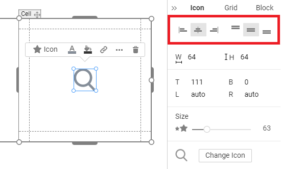
You can click on the Icons in the Alignment section of the Property Panel to align Elements horizontally and vertically.
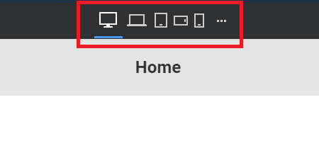
Responsive Modes
A website created with Nicepage is displayed correctly on all modern devices and is easy to read. All Responsive Modes have the same editing features. Therefore, you can customize your website for all mobile views.
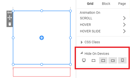
You can Hide Elements, Cells, and Blocks for the desired device by clicking the corresponding icons in the Property Panel's Hide on Devices property.
Preview And Publish
In the Publish and Export dialog, select the "Website" option and click the "Publish Website" button.
- You can see the result in the Preview button on the Top Bar.
- If you like what you see, click the Publish and Export button to publish your website.
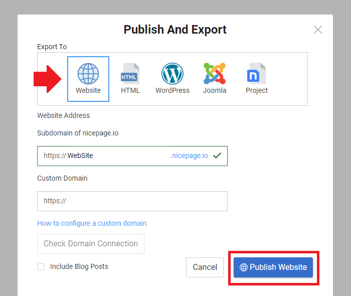
After publication, click the Open button to open the published web page.