HR consulting benefits Template


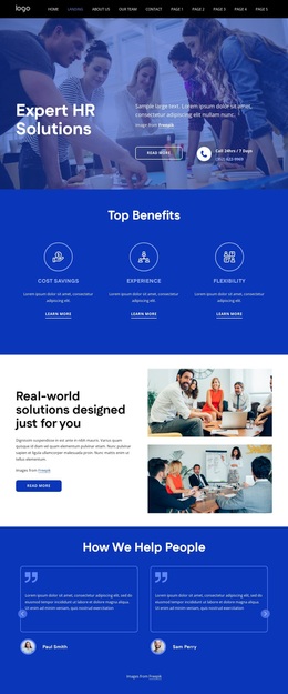
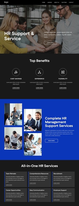
Cost Savings, Experience, and Flexibility Form a Distinctive Benefits Option
The three named benefit columns give this section a more specific identity than a generic features row. Cost Savings, Experience, and Flexibility establish three separate points of emphasis, while the repeated circular icons make them feel like parts of one coordinated system. Each item also includes a learn more link, so the design can introduce concise benefit statements while leaving room for a deeper destination elsewhere in the surrounding page.
The centered “Top Benefits” heading provides a strong entry point before the eye moves across the row. Even column spacing keeps the three items comparable, and the use of uppercase labels makes the categories easy to scan. Against the solid deep blue background, white and light-blue typography creates a clear contrast between the section’s title, benefit names, descriptions, and links. The circular outlined icons add a repeated visual marker without changing the simple informational role of the content.
This design is worth choosing when a page needs to communicate three related advantages with equal visual weight. It avoids the crowded feel of a larger multi-item grid and does not depend on a complex interaction. Instead, the combination of three recognizable labels, consistent icon treatment, and direct learn more links creates a compact section choice for presenting benefits in a calm, structured way.
Customize with Nicepage
Open this ready-made template in the Template Builder and customize it visually in the Nicepage editor. Replace demo content, edit page sections, and adapt the design to your project without rebuilding the template from scratch.
Edit Template Offline
2. Create a new page or select existing
3. Click Add new block, search for id 6400484 and click enter
Edit Template Online
Create Awesome Websites


Free Nicepage Builder
Keywords
Start With a Ready-Made Template
Choose a Design for a New Page
Use a ready-made template as a starting point instead of creating every page from a blank canvas. When adding a new page in Nicepage, browse available designs, compare different layouts, and choose an option that already fits the general purpose and visual direction of your project.
Browse Different Page Designs
Explore Page Designs using search, thematic categories, Design Sets, and full-page previews. The collection includes layouts for different subjects and page purposes, making it easier to compare alternatives before selecting a design to customize.
Customize the Selected Template
After choosing a design, create the page and continue editing it visually in Nicepage. Replace the demo content, adjust images, typography, colors, sections, and other elements, and adapt the ready-made layout to your own content instead of rebuilding the design from the beginning.
Explore More Design Directions
If the first option does not match your project closely enough, return to the design collection and compare other templates before committing to a layout. This makes the template library useful not only for faster page creation, but also for exploring different visual approaches and finding a suitable starting point for a new project.
This workflow gives you access to a broad collection of ready-made designs that can be selected, compared, and customized according to the needs of each new page or project.

Design Set (24)
-

-
-
-
-
-
-
-
-
-
-
-
Free Website Builder SoftwareDownload
-
-
-
-