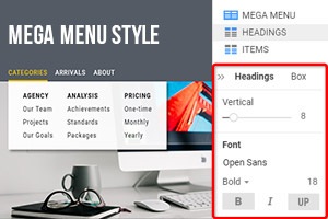
Hur man ändrar bredden på en megameny popup
Everything You Need To Create Your Free Website
Använd vår webbplatsbyggare för att designa och skapa webbplatser utan kodning. Dra och släpp vad du vill, till vilken plats du vill. Webbplatsskaparen anpassar automatiskt din webbplats för mobilen för att göra den lyhörd. Välj bland mer än 15,000 anpassningsbara webbplatsmallar.
Related Features
How to customize the Mega Menu Popup Width on a website
To access theme options under Mega Menu width you need only to click on the menu itself and when the blue frame appears stretch the menu width as much as you need. If you simply max-width of your mega menus this may not improve how the mobile menu and top-level menu item to click on will be presented. Using custom menu settings you can quickly change the level menu item positions, size, style, and text of the menu item on the top. Ley the level menu items and related articles have some space so visitors would clearly see and differ them.
When getting started working with Mega Menus you must attend to many aspects of the menu styling. No matter if it is a website-oriented or mobile menu you must form your custom appearance menus to attract users. The flyout menus can be pleasant surprise mechanics or irritating gimmicks that distract users from navigating through top-level items. So after getting started, it is important to make your custom style of the mobile menu and site menu as user-friendly as possible. And our flexible menu settings will help you with this task.
Under Mega Menu, menu item text will play a crucial role in attracting attention and helping in navigation on the top level. Remember that bigger does not always mean better, especially in the case of mobile menu settings. If you want to use our theme integration for your website, you will have theme options that will help to customize tabbed mega menus. It is better not to use skip to content if you already applied mega menus with various level menu items because the user will decide for himself what content he wants.


