Pet care information Website Design



Edit Template Offline
2. Create new page and search for id 3483627
Edit Template Online
Create Awesome Websites


Free Nicepage Builder
Keywords
Warm Photography Meets a Pink-and-Blue Editorial Identity
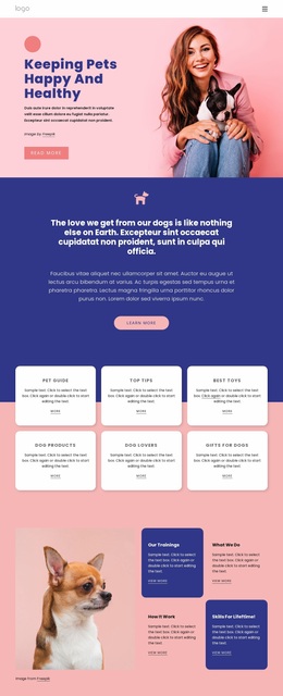
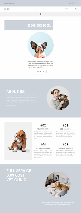
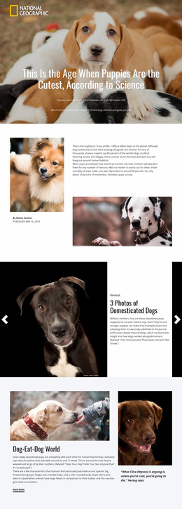
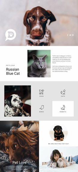
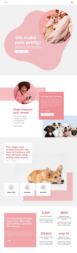
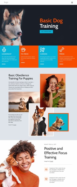
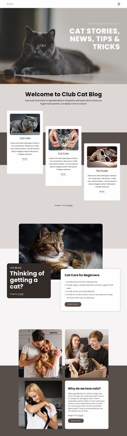
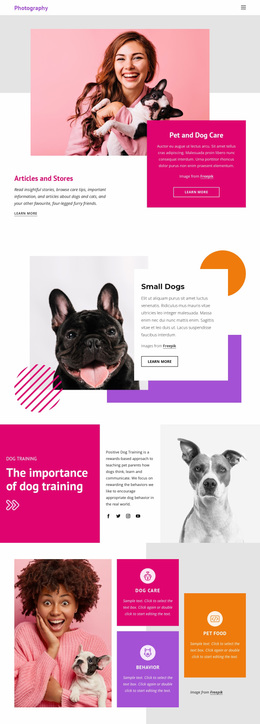
The visual language begins with warm dog-and-owner photography rather than a purely text-led introduction. Pink is used prominently in the hero and newsletter area, creating a welcoming frame for the beginning and end of the reader's journey. Deep blue carries more declarative content, including the centered mission statement, the editorial portrait panel, and the footer. This repeated contrast gives the page recognizable emphasis areas without requiring every section to use the same background.
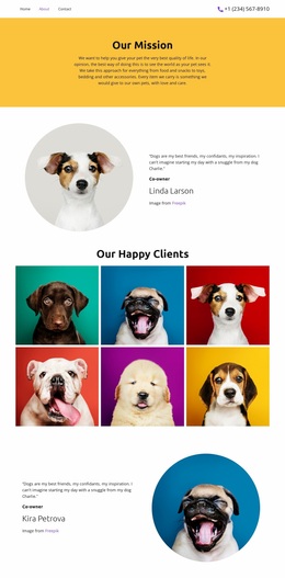
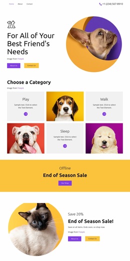
White cards act as the neutral middle layer. They group the six pet-care subjects into a consistent topic family, reappear in the practical tip section, and help the training and behavior content remain readable beside images. Bold rounded display headings provide a friendly personality, while compact body text keeps the information blocks visually controlled. The circular portrait and the four-image Interesting Facts arrangement introduce recurring shape and image motifs that soften the rectangular card grid. Even the footer's social icons and small link groups follow the same coordinated palette and compact treatment. As a website design, the template communicates pet care through a balance of warmth, clarity, and editorial variety: photography supplies emotional context, blue and pink establish recognition, and repeated cards make the content system feel related across the page.
Customize with Nicepage
Open this ready-made template in the Website Design Builder and customize it visually in the Nicepage editor. Replace demo content, edit page sections, and adapt the design to your project without rebuilding the template from scratch.
Create a Consistent Design Across the Website
Define a Site-Wide Visual Style
Use Theme Settings to establish the visual foundation of the website across its pages and sections. Set global Colors, Fonts, and Typography so the site follows the same design direction instead of styling each page independently.
Coordinate Colors and Typography
Choose a color scheme and font combination that fit the character of the website, then fine-tune Headings H1-H6, regular Text, links, buttons, quotes, lists, and other typography styles. Consistent use of these settings helps create a clear visual hierarchy and keeps recurring design elements recognizable throughout the website.
Add Motion and Interaction
Use Animation Effects to make the website design more dynamic and interactive. Elements and Containers can use effects such as Run On Display, Animation On Hover, and Animation Sync With Scroll to introduce content as visitors move through the site or respond to user interaction. Animation Presets provide ready-made effects that can be adapted to the visual style of the website.
Keep the Website Visually Consistent
Apply the same design direction to shared website elements such as the Header, Menu, and Footer. The Theme Settings Panel brings common site-wide styling controls together, making it easier to maintain a coordinated look as the website expands across multiple pages.
This workflow makes the template a useful starting point for creating a website with a consistent visual identity, coordinated colors and typography, shared design rules, and interactive effects across its pages.