Modern devices CSS Template


Centered Typography and Four-Image Balance
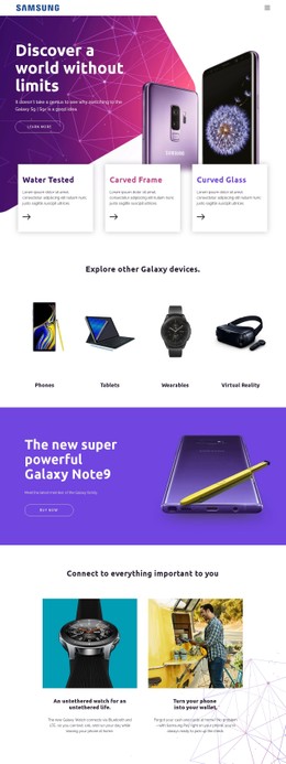
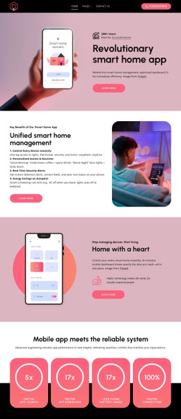
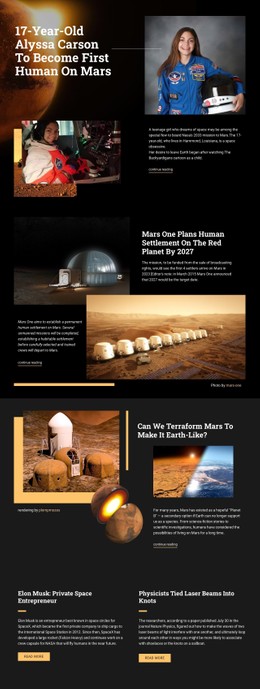
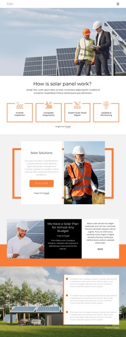
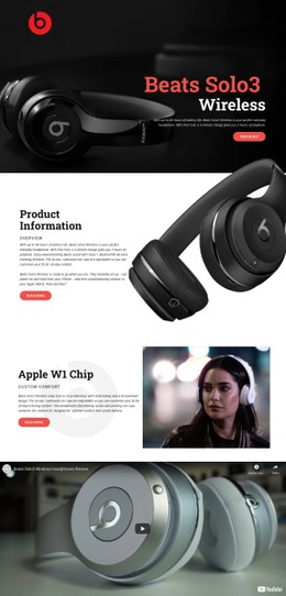
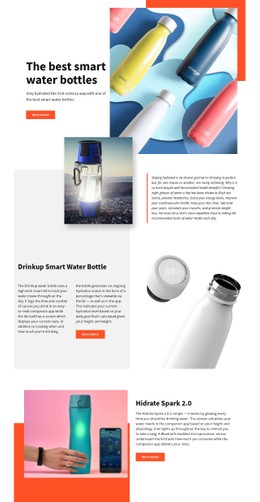
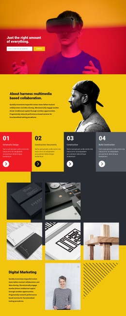
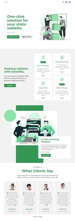
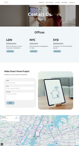
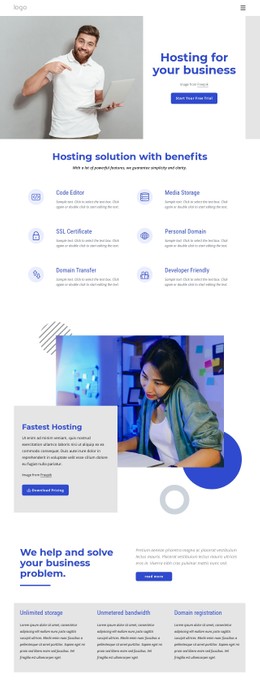
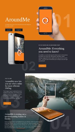
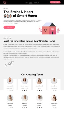
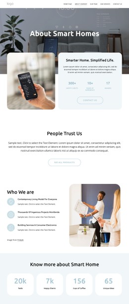
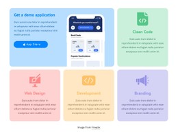
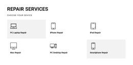
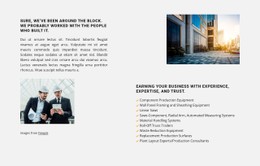
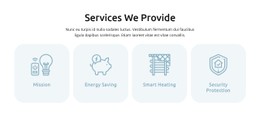
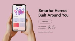
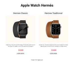
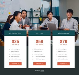
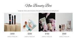
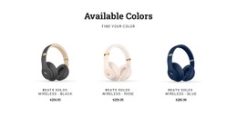
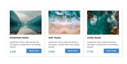
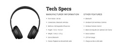
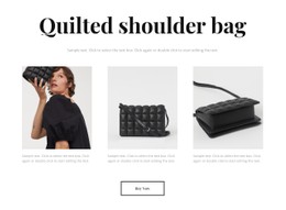
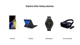
The centered heading establishes a strong visual starting point, and the four category items repeat the same image-and-label pattern beneath it. Phones, Tablets, Wearables, and Virtual Reality therefore receive equal visual weight instead of competing through different card treatments. The white background and generous whitespace leave clear separation around each product image, while the restrained black-and-white palette allows the imagery to provide the main contrast.
For a CSS Template interpretation, the useful styling decisions belong inside this section: heading alignment, text hierarchy, image containment, column spacing, label placement, and the balance between empty space and product detail. The repeated treatment gives the four categories a shared appearance that can be refined without changing the section’s product-category purpose. Adjusting borders, backgrounds, typography, or spacing should preserve the centered heading and the consistent relationship between each image and its label.
The layout is especially sensitive to visual rhythm because all four items sit in one horizontal row in the desktop preview. Equal gaps and comparable image areas help the row read as a unified set. Nicepage’s block and element styling controls can support these refinements, while the content remains focused on the four existing device categories.
Customize with Nicepage
Open this ready-made template in the CSS Template Builder and customize it visually in the Nicepage editor. Replace demo content, edit page sections, and adapt the design to your project without rebuilding the template from scratch.
Edit Template Offline
2. Create a new page or select existing
3. Click Add new block, search for id 56398 and click enter
Edit Template Online
Create Awesome Websites


Free Nicepage Builder
Keywords
Customize This Template With CSS
Control Page-Specific Styling
Customize the visual appearance of this ready-made template directly in the Nicepage editor. Adjust typography, spacing, backgrounds, borders, colors, positioning, and other style properties using visual controls while keeping the page layout easy to manage without writing CSS manually.
Add Custom CSS When Needed
For styling requirements that go beyond the standard editor options, use Custom CSS to add targeted rules. CSS can be applied to individual elements, specific pages, or the entire website depending on the scope of the customization, while CSS classes can be used to connect custom rules with selected elements.
Export Minimal CSS Per Page
For projects where CSS size and page performance matter, Nicepage can export minimal CSS for each page. Instead of relying on one larger common stylesheet, each page can use a separate CSS file containing only the style rules required for that particular page. According to Nicepage documentation, these page-specific CSS files can be about ten times more compact, helping reduce unnecessary CSS and improve page loading performance.
This workflow combines visual styling with optional custom CSS and optimized page-specific CSS output, giving you additional control when a project requires it without making manual CSS editing the primary way to customize the template.