Book your perfect vacations Website Mockup


Edit Template Offline
2. Create new page and search for id 6000418
Edit Template Online
Create Awesome Websites


Free Nicepage Builder
Keywords
Large Circular Images and Dense Destination Cards Need Responsive Review
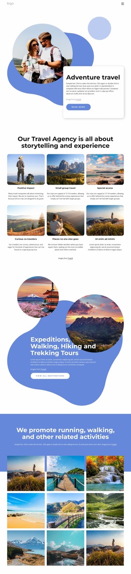
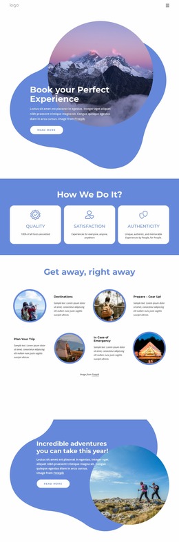
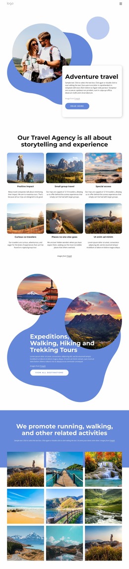
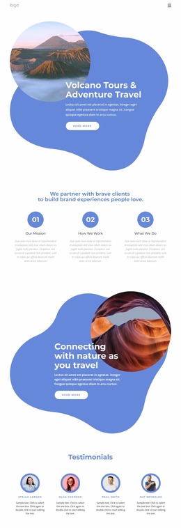
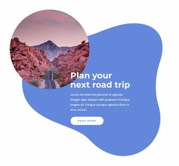
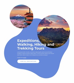
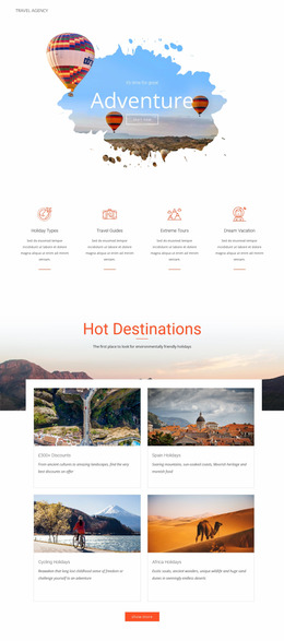
The page depends on a strong relationship between large circular photographs, blue organic shapes, and adjacent text cards. At wide sizes, the mountain-led introduction and later adventure features can hold their visual balance beside the promotional copy and “Read more” actions. At narrower widths, the image scale, text-card width, and order of those paired elements should be checked together so the headline remains prominent and the circular treatment does not crowd the content.
The three white principle cards and the four alternating preparation pairs create different density conditions. The principle cards need to remain distinguishable as a group, while the preparation section must preserve the alternation between image and explanation when columns become narrower. The four topics—destinations, gear preparation, trip planning, and emergency information—also contain longer labels than the compact headings used elsewhere, making text wrapping part of the visual evaluation.
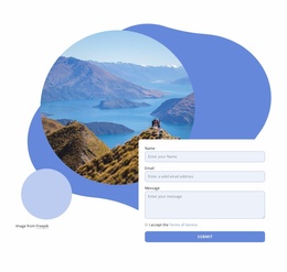
The six-card destination collection is another important review area. New Zealand, Tanzania, Turkey, Namibia, Kenya, and Zambia must remain identifiable when the image grid changes from multiple columns to fewer columns. The newsletter signup and final inquiry form should be checked separately for field width, button visibility, terms acceptance, and surrounding whitespace. Finally, the compact navigation needs clear behavior on smaller screens. Reviewing these transitions as a website mockup helps preserve the design’s blue-and-white contrast, image emphasis, hierarchy, and response points across viewport conditions.
Customize with Nicepage
Open this ready-made template in the Website Mockup Builder and customize it visually in the Nicepage editor. Replace demo content, edit page sections, and adapt the design to your project without rebuilding the template from scratch.
Preview and Refine This Website Mockup
Review the Design Across Devices
Use Responsive Modes to see how the website design appears on Large Screens, Desktops, Laptops, Tablets, and Phones. Switch between the available views to compare the same layout at different screen widths and review how typography, images, spacing, navigation, and other content adapt to each device.
Adapt the Mockup for Different Screens
Nicepage provides responsive web design tools for adjusting individual device views when the initial layout needs refinement. You can customize Mobile Views separately, change element sizes and positions, adapt Grids, Lists, and Galleries, and hide selected Elements or Blocks on particular screen sizes. This makes it possible to develop a responsive website mockup instead of evaluating the design at only one fixed desktop size.
Preview the Website Without Editing Controls
Use Live Page / Preview to review the design with the editing interface removed from view. Instant Preview can hide the Page Navigator, Property Panel, selections, and frames, making it easier to evaluate the overall presentation, content hierarchy, and responsive layout as a visitor would see them.
This workflow makes the template useful as a responsive website mockup for visualizing, comparing, and refining how the same website design will appear across different screen sizes.