Exteme mountain travel Website Mockup

Edit Template Offline
2. Create new page and search for id 39155
Edit Template Online
Create Awesome Websites


Free Nicepage Builder
Keywords
Overlapping Travel Images and Long Text Bands Need Responsive Review
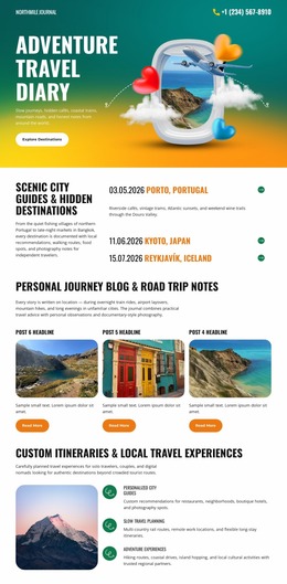
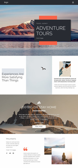
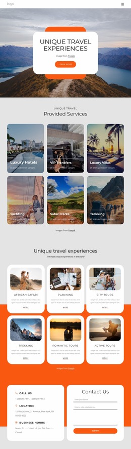
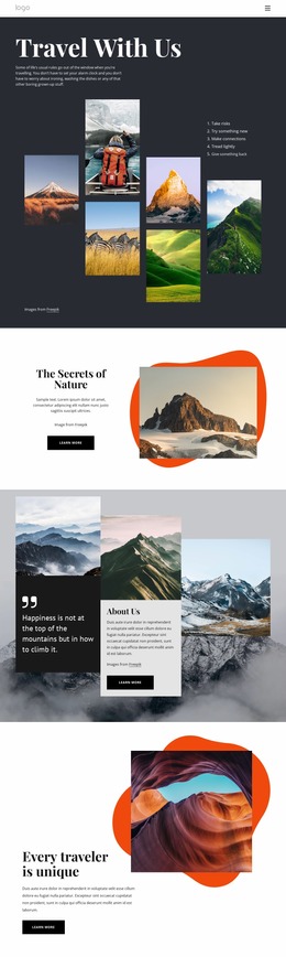
The layered hero is the first presentation area to inspect closely. Several outdoor photographs sit beside and behind a red title panel, so image scale, overlap, and the available width for “Where do you want to go?” can strongly affect the opening impression on narrower screens. The compact navigation and mobile-navigation component also deserve attention because the page moves from a broad desktop header into a long, image-rich reading experience.
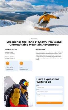
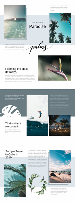
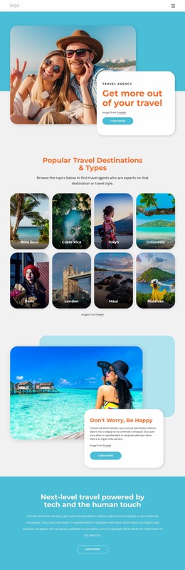
The middle sections create different responsive pressures. The three-image hiking collage is followed by two related text columns, while the budget-travel feature places another outdoor collage beside a contrasting text panel. Those arrangements need visual review for image cropping, column stacking, text measure, and the balance between red blocks and surrounding white space. The pale lavender introduction bands are less dense, but their centered headings and paragraphs still establish the vertical rhythm of the page.
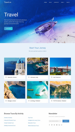
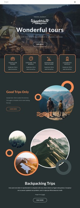
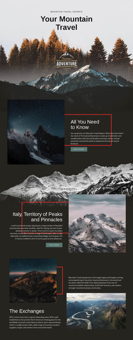
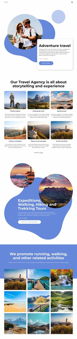
The later grid places one large photograph above two smaller image-and-copy areas, creating another important comparison between wide and narrow presentation. The portrait-led “About Me” section then reduces the composition to image and biography before the dark footer. Reviewing these transitions as a mockup helps identify where image emphasis, typography, spacing, and navigation adaptation may change the character of the travel page across viewport conditions.
Customize with Nicepage
Open this ready-made template in the Website Mockup Builder and customize it visually in the Nicepage editor. Replace demo content, edit page sections, and adapt the design to your project without rebuilding the template from scratch.
Preview and Refine This Website Mockup
Review the Design Across Devices
Use Responsive Modes to see how the website design appears on Large Screens, Desktops, Laptops, Tablets, and Phones. Switch between the available views to compare the same layout at different screen widths and review how typography, images, spacing, navigation, and other content adapt to each device.
Adapt the Mockup for Different Screens
Nicepage provides responsive web design tools for adjusting individual device views when the initial layout needs refinement. You can customize Mobile Views separately, change element sizes and positions, adapt Grids, Lists, and Galleries, and hide selected Elements or Blocks on particular screen sizes. This makes it possible to develop a responsive website mockup instead of evaluating the design at only one fixed desktop size.
Preview the Website Without Editing Controls
Use Live Page / Preview to review the design with the editing interface removed from view. Instant Preview can hide the Page Navigator, Property Panel, selections, and frames, making it easier to evaluate the overall presentation, content hierarchy, and responsive layout as a visitor would see them.
This workflow makes the template useful as a responsive website mockup for visualizing, comparing, and refining how the same website design will appear across different screen sizes.