Burger Menu Web Page Design


Edit Template Offline
2. Create new page and search for id 89239
Edit Template Online
Create Awesome Websites


Free Nicepage Builder
Keywords
Centered Introduction and Stacked Cards Shape the Reading Flow
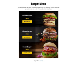
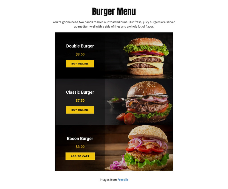
The composition starts with a centered “Burger Menu” heading and description, creating a clear entry point before the product information begins. From there, the page moves vertically through three similarly constructed cards rather than spreading the choices across a wide grid. That decision suits the narrow composition: each burger receives enough visual space for its photograph, while the sequence remains easy to follow from one offering to the next.
The repeated cards create a consistent information rhythm. The Double Burger, Classic Burger, and Bacon Burger each combine an image with a name, price, and ordering action, allowing visitors to compare equivalent content units without learning a new layout for each item. The prices—$8.50, $7.50, and $8.00—are therefore part of the page’s comparison structure, not isolated decorative details. The shared description that burgers are served with fries reinforces the relationship between the three products.
Dark photographs and black overlays create concentrated visual areas, while bold typography separates product information from the imagery. Warm yellow-orange accents add directional emphasis to important text and controls. Strong vertical spacing prevents the cards from merging into one dense block, so the page alternates between image impact and readable product detail. Together, these choices produce a single-page composition that moves from context to selection and then toward online ordering without introducing competing content paths.
Customize with Nicepage
Open this ready-made template in the Web Page Design Builder and customize it visually in the Nicepage editor. Replace demo content, edit page sections, and adapt the design to your project without rebuilding the template from scratch.
Design a Web Page Section by Section
Choose a Design for Each Section
Build the page from individual content sections instead of starting with a fixed full-page layout. Use Block Designs to browse ready-made sections for different purposes, including introductions, services, galleries, testimonials, contact forms, pricing, and other common parts of a web page. Search or filter the available designs to find a layout that fits the content you want to add.
Combine Blocks and Page Elements
Add selected Blocks to the page and arrange them in the order that supports the page's purpose. A hero section can introduce the main message, followed by services, benefits, portfolio content, testimonials, calls to action, or contact information.
Inside each section, use Web Page Elements such as Text, Image, Hyperlink, Grid, Gallery, and other elements to build and present the page content. Individual elements can be added and adjusted within the Blocks, giving you more control over the composition of each section without having to create the complete layout from scratch.
Refine the Page Layout and Flow
After assembling the main sections, adjust their content, spacing, backgrounds, images, typography, and element placement in the Nicepage editor. Reorder Blocks when necessary and refine the transition from one section to the next so the information hierarchy and visual flow remain clear throughout the page.
This workflow makes the template useful as a web page design that can be composed from ready-made sections, customized with individual page elements, rearranged, and adapted to the content and purpose of an individual page.