Fresh, handcrafted bread Web Page Design


The Three-Card Row Establishes a Clear Mid-Page Transition
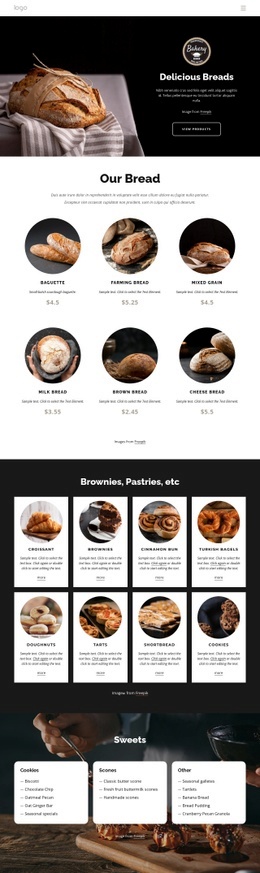
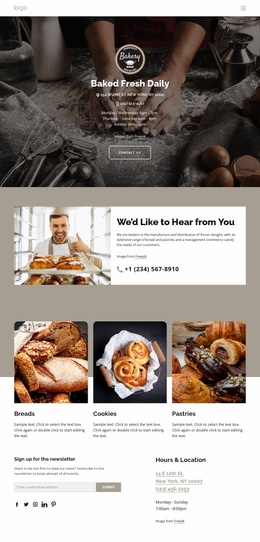
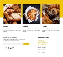
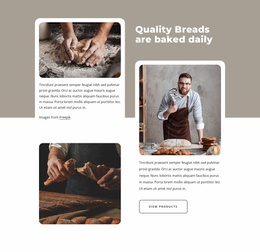
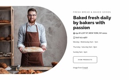
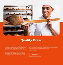
The composition begins with a broad three-column rhythm. The Breads, Cookies, and Pastries cards distribute equal visual weight across the upper portion, while the large rounded food images create a strong first scanning layer. Titles and supporting paragraphs sit directly beneath their images, keeping each category self-contained and making the row easy to read as one coherent content group rather than three disconnected promotions.
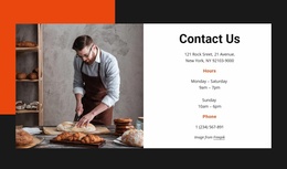
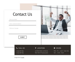
A clear compositional change occurs below the cards. The two-column contact area reduces the repeated-card rhythm and creates a left-right balance between newsletter engagement and practical information. The newsletter heading, supporting text, subscription form, and five social link icons occupy one side; the Hours & Location heading and contact details occupy the other. This change in density gives the section a useful page-flow role, moving visitors from visual category discovery toward contact and ongoing communication.
Warm neutral background tones and white content areas help separate the zones without introducing a hard visual break. Dark typography maintains readable hierarchy, while generous whitespace prevents the form and location details from competing with the category cards. Within one webpage, the block can work as a substantial transition or lower-page composition because it contains enough internal contrast to mark a new phase of content while remaining one reusable section.
Customize with Nicepage
Open this ready-made template in the Web Page Design Builder and customize it visually in the Nicepage editor. Replace demo content, edit page sections, and adapt the design to your project without rebuilding the template from scratch.
Edit Template Offline
2. Create a new page or select existing
3. Click Add new block, search for id 3256697 and click enter
Edit Template Online
Create Awesome Websites


Free Nicepage Builder
Keywords
Design a Web Page Section by Section
Choose a Design for Each Section
Build the page from individual content sections instead of starting with a fixed full-page layout. Use Block Designs to browse ready-made sections for different purposes, including introductions, services, galleries, testimonials, contact forms, pricing, and other common parts of a web page. Search or filter the available designs to find a layout that fits the content you want to add.
Combine Blocks and Page Elements
Add selected Blocks to the page and arrange them in the order that supports the page's purpose. A hero section can introduce the main message, followed by services, benefits, portfolio content, testimonials, calls to action, or contact information.
Inside each section, use Web Page Elements such as Text, Image, Hyperlink, Grid, Gallery, and other elements to build and present the page content. Individual elements can be added and adjusted within the Blocks, giving you more control over the composition of each section without having to create the complete layout from scratch.
Refine the Page Layout and Flow
After assembling the main sections, adjust their content, spacing, backgrounds, images, typography, and element placement in the Nicepage editor. Reorder Blocks when necessary and refine the transition from one section to the next so the information hierarchy and visual flow remain clear throughout the page.
This workflow makes the template useful as a web page design that can be composed from ready-made sections, customized with individual page elements, rearranged, and adapted to the content and purpose of an individual page.