Become a pro chief Landing Page


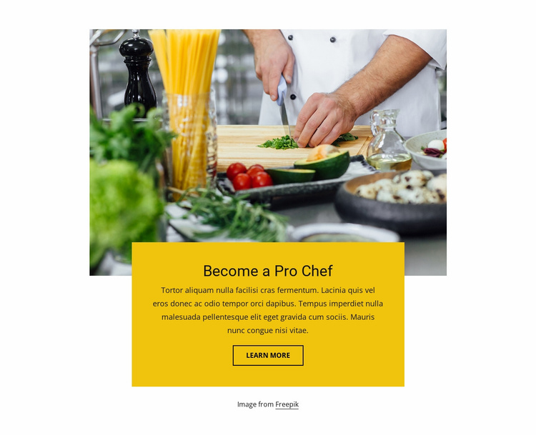
The Overlapping Card Turns Culinary Imagery Into a Response Step
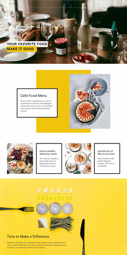
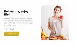
The food preparation photograph can introduce the culinary opportunity, while the yellow overlapping card gives the landing-page sequence a focused message stage. The Become a Pro Chef heading names the proposition, the supporting paragraph provides room for a short explanation, and the learn more button offers a direct route toward further information. This relationship lets the section support visitor movement without claiming that it contains the entire conversion path.
The layered vertical composition helps the block operate as a deliberate pause between broader landing-page messages. Visitors encounter the photograph first, then move into the bright card where the promotional copy and action are grouped together. Strong black text keeps the proposition legible against the yellow background, and the outlined button creates a recognizable response point without overpowering the heading. The centered arrangement also limits competing visual directions, which suits a section with one primary message.
A later part of the landing-page sequence could provide detailed program information, enrollment guidance, or a fuller contact action. Here, the verified learn more link is best understood as the block's invitation to continue, not as proof of a complete form or purchase workflow. The Freepik credit remains a small supporting detail below the section. This makes the block useful for introducing or reinforcing a chef-focused offer before the visitor reaches a more detailed response area.
Customize with Nicepage
Open this ready-made template in the Landing Page Builder and customize it visually in the Nicepage editor. Replace demo content, edit page sections, and adapt the design to your project without rebuilding the template from scratch.
Edit Template Offline
2. Create a new page or select existing
3. Click Add new block, search for id 815715 and click enter
Edit Template Online
Create Awesome Websites


Free Nicepage Builder
Keywords
Build a Landing Page Around One Conversion Goal
Focus on One Primary Action
Use the landing page to guide visitors toward one measurable response, such as requesting a quote, registering, subscribing, booking a consultation, applying for a service, or submitting an inquiry. Keep the primary call-to-action consistent across the important sections so the headline, supporting content, form, and CTA buttons work toward the same campaign goal instead of competing for attention.
Capture Leads With a Form
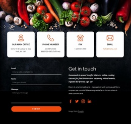
Use the Contact Form Element to add a contact, subscription, application, or other conversion form directly to the landing page. Customize the form fields, layout, labels, inputs, and button to collect the information required for your campaign while keeping the form focused on the action you want visitors to complete.
Nicepage also provides several form submission options. Form submissions can be sent to Email, stored as Leads, added to Google Sheets, passed to a custom URL or server endpoint, or used to populate a MailChimp mailing list. This provides practical options for collecting inquiries, registrations, subscriptions, applications, and other campaign responses.
Manage Leads and Campaign Responses
When submissions are stored as Leads, you can use Contact Form Leads to review the information collected through the landing page and use it for follow-up. Keep the form connected to the same offer and primary CTA presented throughout the page so visitors move from the campaign message to a clear conversion action.
This workflow makes the template suitable for landing pages where the offer, content, call-to-action, form, and lead collection process work together toward one defined conversion goal.