Classic pricing table Landing Page


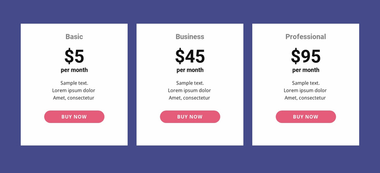
Parallel plans turn comparison into a decision point
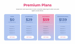
The three cards create a concentrated decision stage for a landing-page sequence. Basic, Business, and Professional are visible together, allowing visitors to compare the available plan labels, monthly billing amounts, and short supporting descriptions before selecting an action. Each purchase button sits within the same card as the plan it serves, so the response path remains connected to the information that explains the option rather than being separated into an unrelated control.
The visual hierarchy supports that decision process. White cards contrast strongly with the dark blue-purple background, centered typography keeps the plan and price prominent, and the repeated rounded pink buttons establish a consistent action signal across all three choices. Generous spacing reduces visual competition between adjacent plans, while equal-width columns communicate that the options belong to one comparison set. The static presentation is useful here because all alternatives remain available for review at the same time.
Within a broader landing-page flow, this block can follow an offer or benefit explanation and precede supporting details, reassurance, or additional response content. The displayed prices and sample descriptions define the card pattern; final project content determines the actual offer. The section's strongest contribution is a clear transition from evaluating plans to choosing a corresponding purchase action, without requiring the surrounding sequence to duplicate its comparison structure.
Customize with Nicepage
Open this ready-made template in the Landing Page Builder and customize it visually in the Nicepage editor. Replace demo content, edit page sections, and adapt the design to your project without rebuilding the template from scratch.
Edit Template Offline
2. Create a new page or select existing
3. Click Add new block, search for id 42403 and click enter
Edit Template Online
Create Awesome Websites


Free Nicepage Builder
Keywords
Build a Landing Page Around One Conversion Goal
Focus on One Primary Action
Use the landing page to guide visitors toward one measurable response, such as requesting a quote, registering, subscribing, booking a consultation, applying for a service, or submitting an inquiry. Keep the primary call-to-action consistent across the important sections so the headline, supporting content, form, and CTA buttons work toward the same campaign goal instead of competing for attention.
Capture Leads With a Form
Use the Contact Form Element to add a contact, subscription, application, or other conversion form directly to the landing page. Customize the form fields, layout, labels, inputs, and button to collect the information required for your campaign while keeping the form focused on the action you want visitors to complete.
Nicepage also provides several form submission options. Form submissions can be sent to Email, stored as Leads, added to Google Sheets, passed to a custom URL or server endpoint, or used to populate a MailChimp mailing list. This provides practical options for collecting inquiries, registrations, subscriptions, applications, and other campaign responses.
Manage Leads and Campaign Responses
When submissions are stored as Leads, you can use Contact Form Leads to review the information collected through the landing page and use it for follow-up. Keep the form connected to the same offer and primary CTA presented throughout the page so visitors move from the campaign message to a clear conversion action.
This workflow makes the template suitable for landing pages where the offer, content, call-to-action, form, and lead collection process work together toward one defined conversion goal.

More from Pricing Blocks
-
-

-
-
-
-
-
-
-
-
-
Free Website Builder SoftwareDownload
-
-
-
-
-
-
-
-
-
-