Sport club team Landing Page


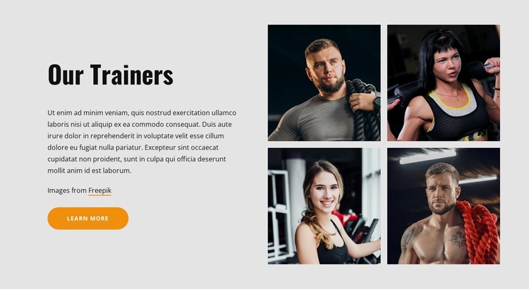
The Trainer Grid Builds Context Before the Next Response
The left column gives the landing-page sequence a concise team-introduction stage. “Our Trainers” names the subject, the supporting paragraph supplies context, and the “Learn more” button offers a next step without competing with the section’s main message. The four portrait images on the right reinforce that message visually, presenting the trainer group as a recognizable team rather than leaving the introduction as text alone. Their two-by-two arrangement keeps several faces visible at once and gives the block a stronger proof-and-context role than a single supporting photograph.
This makes the section suitable for a point in a fitness-focused response path where visitors need to understand who stands behind the service before continuing. The block can support confidence and interest, while a later section handles the primary inquiry, registration, booking, or membership action if one is required. The generic “Learn more” label provides a follow-up route, but its destination and conversion purpose belong to the surrounding page sequence rather than being assumed here.
Visually, the light gray background separates the trainer introduction from adjacent campaign content. The bold black heading creates an immediate entry point, and the orange rounded button provides a contrasting action cue beneath the copy. The static split composition therefore combines explanation, human imagery, and a possible continuation in one bounded section. It contributes to the response path without becoming the entire landing page or claiming a specific submission workflow.
Customize with Nicepage
Open this ready-made template in the Landing Page Builder and customize it visually in the Nicepage editor. Replace demo content, edit page sections, and adapt the design to your project without rebuilding the template from scratch.
Edit Template Offline
2. Create a new page or select existing
3. Click Add new block, search for id 2603562 and click enter
Edit Template Online
Create Awesome Websites


Free Nicepage Builder
Keywords
Build a Landing Page Around One Conversion Goal
Focus on One Primary Action
Use the landing page to guide visitors toward one measurable response, such as requesting a quote, registering, subscribing, booking a consultation, applying for a service, or submitting an inquiry. Keep the primary call-to-action consistent across the important sections so the headline, supporting content, form, and CTA buttons work toward the same campaign goal instead of competing for attention.
Capture Leads With a Form
Use the Contact Form Element to add a contact, subscription, application, or other conversion form directly to the landing page. Customize the form fields, layout, labels, inputs, and button to collect the information required for your campaign while keeping the form focused on the action you want visitors to complete.
Nicepage also provides several form submission options. Form submissions can be sent to Email, stored as Leads, added to Google Sheets, passed to a custom URL or server endpoint, or used to populate a MailChimp mailing list. This provides practical options for collecting inquiries, registrations, subscriptions, applications, and other campaign responses.
Manage Leads and Campaign Responses
When submissions are stored as Leads, you can use Contact Form Leads to review the information collected through the landing page and use it for follow-up. Keep the form connected to the same offer and primary CTA presented throughout the page so visitors move from the campaign message to a clear conversion action.
This workflow makes the template suitable for landing pages where the offer, content, call-to-action, form, and lead collection process work together toward one defined conversion goal.

Design Set (15)
-

-
-
-
-
-
-
Free Website Builder SoftwareDownload
-
-
-
-
-





More from Sports Blocks
-

-
-
-
-
-
-
-
-
-
-
Free Website Builder SoftwareDownload
-
-
-
-
-
-
-
-
-
-



More from Split Blocks
-

-
-
-
-
-
-
-
-
-
-
Free Website Builder SoftwareDownload
-
-
-
-
-
-
-
-
-
-