Use the Text Elements to output text content on a web page. Texts provide visitors with information and help to promote a website on the Internet.
Video Lesson
See Also
Add Text Elements
Add the Text and Heading Elements to a Block by clicking or dragging from the Quick Access Add Panel. You can also press the Alt+1, Alt+2, Alt+3, Alt+4, Alt+5, and Alt+6 hotkeys to insert Headings.

Please note that you can change the Heading style at any time in the Context Toolbar or in the Property Panel -> Font section.
Text Presets
You can insert the Text using the Presets, for example, Blockquote, Text With Icon, Lists, Title, Subtitle, Lead Text, or Small Text.

Rich Text
Go to the Quick Access Add Panel -> Text -> Rich Text to add the Rich Text Element. The Rich Text Element allows editing of long-text articles with inserted in-text images.
Text Styles
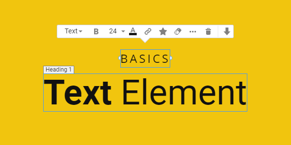
Text Context Toolbar
Customize the Text Element using the Context Toolbar. It contains the most used operations. You can modify all properties in the Property Panel to the right.

Text Styles
We have added the Text Tags to the Context Toolbar to improve its usability.

You can now see Icons in the Property Panel, the Text Style property.

Font Size, Bold, And Color
In the Context Toolbar, you can edit the Text Size and color or turn the Bold emphasis on and off.

Add Icon To Text
You can add an icon to the Text Elements by clicking the Icon in the Context Toolbar. You can also edit the Icon in the Text Element in the Property Panel.
You can also use the Preset to insert the Text With Icon from the Add Panel.
Clear Formatting
Reset Text Elements to the default styling by clicking the Clear Formatting icon in the Context Toolbar.

Move Text
You can move the Text Element up and down by clicking on the Arrow icons. You can also drag and drop it on the placeholder.

Edit Selected Text
You can stylize a part of your Text by selecting it and setting its Properties in the Context Toolbar or Property Panel.

Auto / Fixed Text
In the Context Menu, set the Text Element's Width to Fixed to improve its placement and alignment in the layout.

You can change this value in the Property Window.
Text Properties
Edit all the properties of the Text Element in the Property Panel.
Text Width
Set the Width of the Text Element in pixels.

Text Margins
Edit the Top, Bottom, Left, and Right Margins for the Text Element in the Property Panel.

Text Style Option
Change the Styles of the Text Element, including Heading 1, Heading 2, ..., Title, Lead Text, Blockquote, Ordered List, еtс., in the Property Panel.
You can use the Style Options to easily apply, update, and edit the Text Theme Styles.

Text Color
You can edit the Text Color in the Property Panel. You can also select the Dark, Light, and Theme Colors, which you can modify in the Theme Settings. The Additional Colors are automatically built from the primary palette.
You can add a New Color if needed. The Theme Colors can be accessed from the Color Picker dialog.

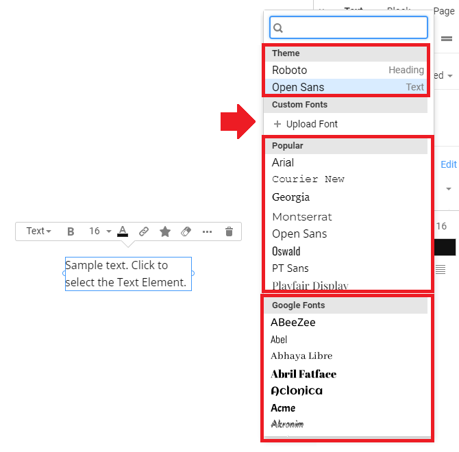
Text Font Family, Size, And Weight
Select the Font Family, Size, and Weight for the Text Element in the Property Panel.

Theme, Popular, Google, and Custom Fonts
For convenience, the Fonts are sorted by Font Family in the Font Family property. Start with the Theme Fonts. You can also use the Popular section, with over 900 Google Fonts, and upload a Custom Font if needed.
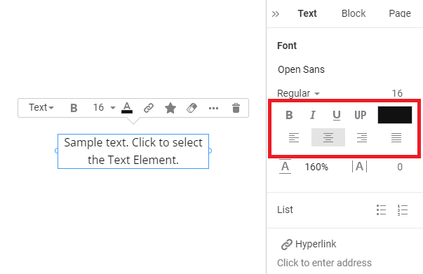
Basic Formatting And Alignment
In the Property Panel, set the Text's basic formatting, including bold, italic, and underline. Also, choose one standard Text Alignment: Left, Center, Right, or Justify.
Text Line Height and Letter Spacing
Set the Line Height in percentage and Letter Spacing in pixels for the Text Elements.

Line Height In Pixels
You can enter Text Line Height in pixels in the properties for precise spacing control if needed. After entering, the value is recalculated for the percentage.
Text Uppercase
Make all Text Elements upper case letters by clicking the UP icon.

Text Strikethrough
You can set the Strikethrough Style in the Text's Font Weight and Style dropdown list.

Text Lists
Add the numbered and Bulleted Lists to itemize the Text Element in the Property Panel.

Bullet Icon And Item Spacing
You can change the default Bullet for an Icon in the Bulleted List, set its Color and Size, and edit the Spacing for the List Items and Bullet Icons of the Text List Element.
Link Text Elements
Using the Context Toolbar, you can link the Text Element in the Property Panel or the selected part.

Text Shadow
You can add the Text Shadow by clicking the checkbox and selecting a Preset, and you can customize the Text Shadow Settings.

Responsive Modes
Edit the text element sizes in each responsive mode.