Space CSS Template


Edit Template Offline
2. Create new page and search for id 23167
Edit Template Online
Create Awesome Websites


Free Nicepage Builder
Keywords
Dark Space Imagery Meets Light Educational Panels
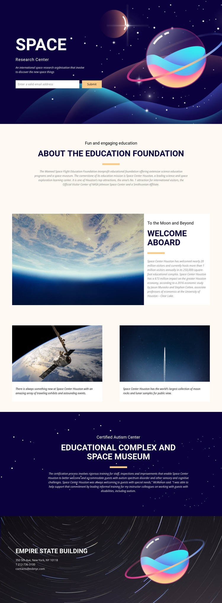
The visual system depends on contrast between dark astronomical sections and lighter educational panels. The opening hero uses a large space illustration, white heading, compact supporting copy, and centered spacing to establish the subject immediately while keeping the email sign-up visible within the same composition. This gives the first section a strong atmospheric treatment without separating the visitor response from the visual introduction.
The lighter foundation section changes the page rhythm. Its centered heading, short eyebrow, divider, and explanatory text create a quieter reading area for the education message. The following split section then returns to image-led presentation by placing a large space photograph beside a narrow white text panel. Repeated shifts between image depth and open white space prevent the page from becoming visually uniform.
The two equal feature cards continue that styling logic at a smaller scale. Their image-and-caption treatment gives traveling exhibits, events, moon rocks, and lunar samples a shared visual frame. Dark backgrounds, high-contrast type, atmospheric imagery, and generous spacing therefore operate as connected style rules across the page. When adapting the design with CSS, these relationships matter more than isolated decoration: colors, spacing, text contrast, panel widths, card treatment, and image scale should remain coordinated so the education and museum content retains its recognizable space-oriented appearance.
Customize with Nicepage
Open this ready-made template in the CSS Template Builder and customize it visually in the Nicepage editor. Replace demo content, edit page sections, and adapt the design to your project without rebuilding the template from scratch.
Customize This Template With CSS
Control Page-Specific Styling
Customize the visual appearance of this ready-made template directly in the Nicepage editor. Adjust typography, spacing, backgrounds, borders, colors, positioning, and other style properties using visual controls while keeping the page layout easy to manage without writing CSS manually.
Add Custom CSS When Needed
For styling requirements that go beyond the standard editor options, use Custom CSS to add targeted rules. CSS can be applied to individual elements, specific pages, or the entire website depending on the scope of the customization, while CSS classes can be used to connect custom rules with selected elements.
Export Minimal CSS Per Page
For projects where CSS size and page performance matter, Nicepage can export minimal CSS for each page. Instead of relying on one larger common stylesheet, each page can use a separate CSS file containing only the style rules required for that particular page. According to Nicepage documentation, these page-specific CSS files can be about ten times more compact, helping reduce unnecessary CSS and improve page loading performance.
This workflow combines visual styling with optional custom CSS and optimized page-specific CSS output, giving you additional control when a project requires it without making manual CSS editing the primary way to customize the template.