Text and social icons CSS Template


Light-gray copy and purple social panel define the visual balance
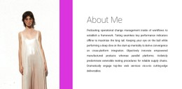
The light-gray text panel and saturated purple social-links panel create the block’s main styling relationship. The left side carries the “About Work” heading and two paragraphs, so its quieter background supports reading without competing with the message. On the right, the narrower purple area gives Facebook, Twitter, and Instagram links a concentrated visual treatment rather than spreading them across the text region.
For a CSS Template interpretation, the useful styling decisions are local to this section: the contrast between the two panel backgrounds, the dark heading, the left alignment, and the generous padding that separates the copy from the panel edges. The stronger emphasis in the second paragraph can also be preserved as a distinct typographic level instead of flattening both paragraphs into one visual weight.
These choices make the section a practical reference for refining appearance while keeping its about/work content intact. Adjustments to color, spacing, typography, or panel proportions can change the visual character of the block without turning the social links into a separate content area or changing the two-column relationship. The same visual rules can be refined independently while the section’s reading order remains stable.
Customize with Nicepage
Open this ready-made template in the CSS Template Builder and customize it visually in the Nicepage editor. Replace demo content, edit page sections, and adapt the design to your project without rebuilding the template from scratch.
Edit Template Offline
2. Create a new page or select existing
3. Click Add new block, search for id 1317515 and click enter
Edit Template Online
Create Awesome Websites


Free Nicepage Builder
Keywords
Customize This Block With CSS
Refine the Section Styling
Customize the visual appearance of the block in the Nicepage editor by adjusting typography, spacing, backgrounds, borders, colors, alignment, sizing, and other style properties. Because the block remains one section inside a larger page, styling can focus on the elements that define this particular content area without requiring the rest of the page to use the same treatment.
Add Targeted Custom CSS When Needed
For styling requirements beyond the standard editor controls, use Custom CSS to add targeted rules. CSS can be applied at different scopes, including individual elements, pages, or the website, while CSS classes can connect custom rules with selected elements. This makes it possible to extend the styling of a specific block while keeping its content structure intact.
Review the Block Across Screen Sizes
When spacing, alignment, image proportions, grids, or repeated items change significantly between desktop and mobile layouts, use Responsive Modes to review the same block at different screen widths. The goal is to preserve the visual hierarchy of the section while adapting its styling to the surrounding page.
This workflow keeps the block focused on its original content purpose while giving you visual control over how that section appears within the final page.