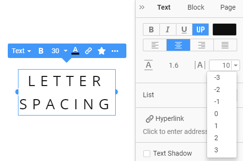
Como ajustar o espaçamento entre letras para textos em uma página da web
Tudo que você precisa para criar seu site gratuito
Use nosso Construtor de Sites para projetar e criar sites sem codificação. Arraste e solte o que quiser, para qualquer lugar que quiser. O Criador de sites adapta automaticamente seu site para dispositivos móveis para torná-lo responsivo. Escolha entre mais de 9.000 modelos de sites personalizáveis.
Recursos Relacionados
How to Adjust the Letter Spacing Of the Text Elements
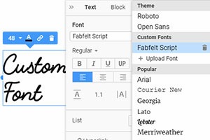
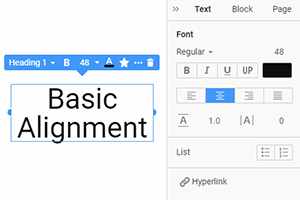
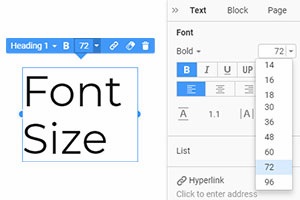
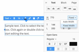
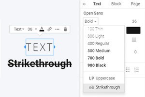
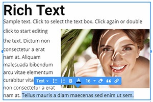
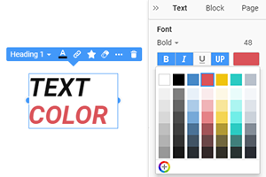
Typography is one of the most important parts of website design and plays a huge role in creating content. Using the letter spacing and tracking the letters, you can control the style of the texts. Select the needed element from the property panel and change the spacing between letters, vertical space between lines, etc. It is a very useful feature, as it helps to adjust the space between letters, and web designers can modify their texts in one click. You can choose the font and line size you will use for the text. Make sure that this feature will help you for creating beautiful-looking texts.
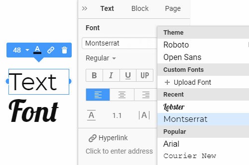
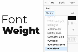
There is little spacing between the letters and symbols only where designers use heavy fonts and apply a large size. Studies show that people remember things better because of the large font sizes. Starting with the body text size: use a 16px-18px font size and a regular font weight. Small fonts are understandably harder to follow, so more line spacing can be required to make it easier for the human eye to follow them. Some types of fonts have more space than others, which gives the appearance that one typescript is greater than the other and more or smaller vertical space between lines. Tracking is a process that influences word spacing, spacing between characters, white space, and the font mixture.
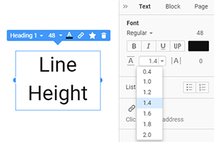
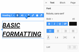
The interval between the main and body text should be clear and simple. The type size of headings and body text are also key factors for the total flow and the aesthetics of an effective web design. Capital letter tracking is a basic thing web designers employ in the initial web design phase. Web designers and printers have stopped managing paragraph font size and the spaces between small characters in body text. When discussing text size for web design, we may use what these guidelines discussed for a series of font types have been. If you want to design web pages, keep in mind that the types of fonts as typesets are the main parts of overall branding.