Como alterar o espaçamento do Mega Menu
Tudo que você precisa para criar seu site gratuito
Use nosso Construtor de Sites para projetar e criar sites sem codificação. Arraste e solte o que quiser, para qualquer lugar que quiser. O Criador de sites adapta automaticamente seu site para dispositivos móveis para torná-lo responsivo. Escolha entre mais de 9.000 modelos de sites personalizáveis.
Recursos Relacionados
How To Edit Spacing Between The Mega Menu Items
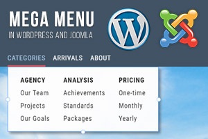
The Mega Menu is a top-level page navigation element for websites that help users, and site visitors quickly look through the website's content and explore its content. Your menu will improve, similar to WordPress menus with navigation on one page. The top-level menu bar in Mega Menus always contains many items. Whether you are using a horizontal or vertical menu bar, you must always make sure that your menu itself and its items are visible, easy to read and attract the users' attention. After getting started, the space between them may change the overall page view. Our site builder provides flexible and responsive menu item options to make the customization process quick and easy.
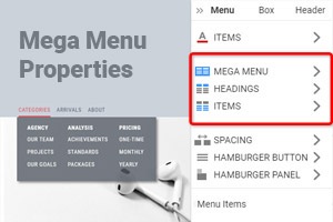
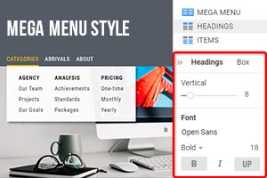
On the top level of the Mega Menus, a menu bar can help users navigate through different categories. You can re-form the Dropdown Menus any way you want to achieve the necessary effect. One of the methods to make a menu item eye-catching is making menu item text font awesome and customizing the whole spacing between menu items. The spacing between menu item text will help to recognize the item text quicker and, therefore, understand if this item is what you were looking for. Using our property panel, it is easy to change the overall space between menu items, horizontally or vertically. Combine it with the appropriate background color of dropdown menus on your landing page and beautiful item text, and your navigation menu will be perfect.
Every item on the top level can be customized and stressed. The amount of space between menu items can influence the menu bar depending on whether you use the horizontal or vertical menu. On the top level where items are situated, a Dropdown Menu spacing between top-level items can also indicate the importance of certain items. For example, the main section discussion is more important than new comments. The space between the top-level menu item in Mega Menus and another item can be stressed using background color similar to how it is used in a mobile Dropdown Menu. Any mobile menu can become a part of a Mega Menus structure and provide the same effect for visitors.


