Zero Waste Tips Website Mockup


Four stacked cards define the main responsive review points
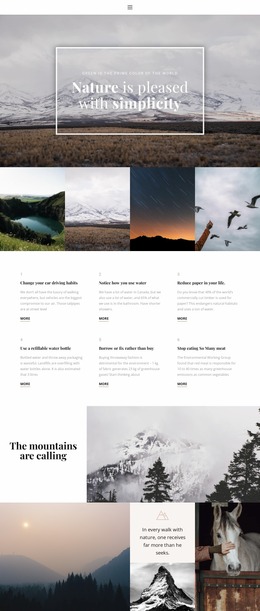
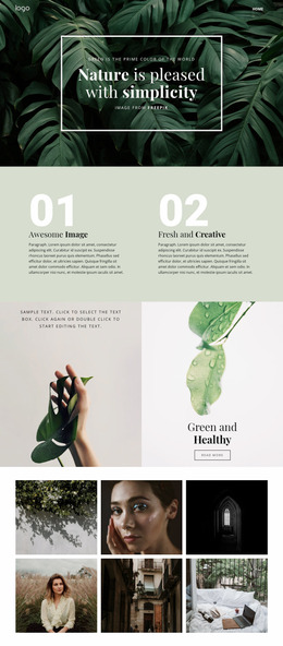
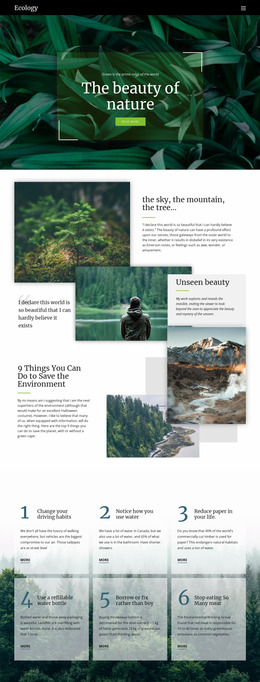
The block depends on a readable relationship between four vertically arranged tip cards and the full-width nature image behind them. In a website mockup, the first review point is the list height: each supporting paragraph must wrap without making the sequence feel unnecessarily compressed or excessively long. The large numbered markers should remain visually distinct as the text changes width, and the generous spacing should continue to separate one item from the next.
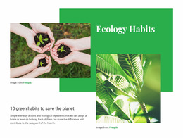
The background image also deserves attention across screen sizes. The plant held in hands appears on the right side, so a narrower presentation may alter how much of that subject remains visible behind the content area. The dark translucent panel must continue to distinguish the white text from the green image, especially where the background has lighter or more detailed areas. The heading above the list should retain its left alignment and clear separation from the cards. Reviewing these relationships in the mockup helps evaluate the section as a complete visual unit: topic introduction, ordered information, image context, and contrast should remain balanced even when the available width changes.
Customize with Nicepage
Open this ready-made template in the Website Mockup Builder and customize it visually in the Nicepage editor. Replace demo content, edit page sections, and adapt the design to your project without rebuilding the template from scratch.
Edit Template Offline
2. Create a new page or select existing
3. Click Add new block, search for id 84737 and click enter
Edit Template Online
Create Awesome Websites


Free Nicepage Builder
Keywords
Preview and Refine This Website Mockup
Review the Design Across Devices
Use Responsive Modes to see how the website design appears on Large Screens, Desktops, Laptops, Tablets, and Phones. Switch between the available views to compare the same layout at different screen widths and review how typography, images, spacing, navigation, and other content adapt to each device.
Adapt the Mockup for Different Screens
Nicepage provides responsive web design tools for adjusting individual device views when the initial layout needs refinement. You can customize Mobile Views separately, change element sizes and positions, adapt Grids, Lists, and Galleries, and hide selected Elements or Blocks on particular screen sizes. This makes it possible to develop a responsive website mockup instead of evaluating the design at only one fixed desktop size.
Preview the Website Without Editing Controls
Use Live Page / Preview to review the design with the editing interface removed from view. Instant Preview can hide the Page Navigator, Property Panel, selections, and frames, making it easier to evaluate the overall presentation, content hierarchy, and responsive layout as a visitor would see them.
This workflow makes the template useful as a responsive website mockup for visualizing, comparing, and refining how the same website design will appear across different screen sizes.