Creative Bookstore Website Mockup
Edit Template Offline
2. Create new page and search for id 6666298
Edit Template Online
Create Awesome Websites


Free Nicepage Builder
Keywords
Large Imagery, Card Density, and Footer Columns Mark the Key Review Areas
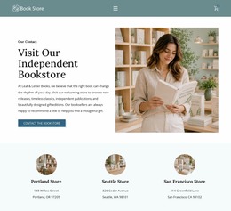
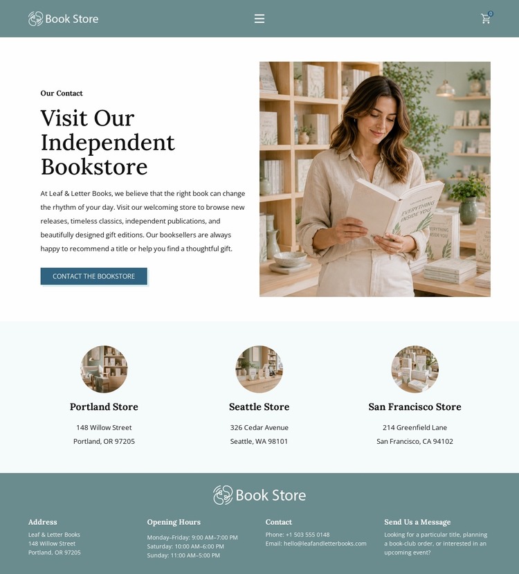
The split introduction is the first area to inspect in a visual presentation review because it places explanatory copy and a large bookstore image side by side. The image must retain enough presence to establish the bookstore setting, while the text and Contact the Bookstore button need to remain readable beside it. The compact navigation above it should also be checked as a single horizontal line, especially because it combines brand access, several menu links, store access, and a shopping-cart icon.
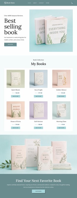
The three location cards create a second review point. Their repeated row works clearly at the shown width, but Portland, Seattle, and San Francisco must remain distinguishable if the available space narrows. Text wrapping, card spacing, and the visual equality of the three entries affect how easily visitors compare stores. The footer introduces a denser four-column arrangement containing address, opening hours, contact details, and message guidance; this is another area where column compression and hierarchy deserve attention. Portland’s schedule, displayed phone number, email, and three addresses provide realistic content density for that evaluation. The muted teal, pale blue-green, serif typography, and dark footer should also be reviewed together so contrast survives across screen conditions. This mockup is therefore useful for examining presentation behavior in the concrete areas most likely to change: split composition, navigation width, repeated cards, and information-heavy footer columns.
Customize with Nicepage
Open this ready-made template in the Website Mockup Builder and customize it visually in the Nicepage editor. Replace demo content, edit page sections, and adapt the design to your project without rebuilding the template from scratch.
Preview and Refine This Website Mockup
Review the Design Across Devices
Use Responsive Modes to see how the website design appears on Large Screens, Desktops, Laptops, Tablets, and Phones. Switch between the available views to compare the same layout at different screen widths and review how typography, images, spacing, navigation, and other content adapt to each device.
Adapt the Mockup for Different Screens
Nicepage provides responsive web design tools for adjusting individual device views when the initial layout needs refinement. You can customize Mobile Views separately, change element sizes and positions, adapt Grids, Lists, and Galleries, and hide selected Elements or Blocks on particular screen sizes. This makes it possible to develop a responsive website mockup instead of evaluating the design at only one fixed desktop size.
Preview the Website Without Editing Controls
Use Live Page / Preview to review the design with the editing interface removed from view. Instant Preview can hide the Page Navigator, Property Panel, selections, and frames, making it easier to evaluate the overall presentation, content hierarchy, and responsive layout as a visitor would see them.
This workflow makes the template useful as a responsive website mockup for visualizing, comparing, and refining how the same website design will appear across different screen sizes.