Kids Anniversary Website Mockup
Edit Template Offline
2. Create new page and search for id 6637375
Edit Template Online
Create Awesome Websites


Free Nicepage Builder
Keywords
Dense Card Groups and Large Color Fields Need Responsive Review
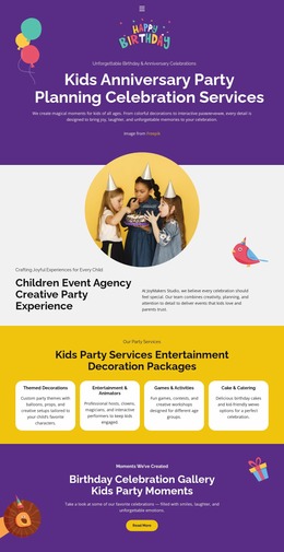
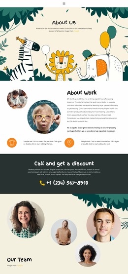
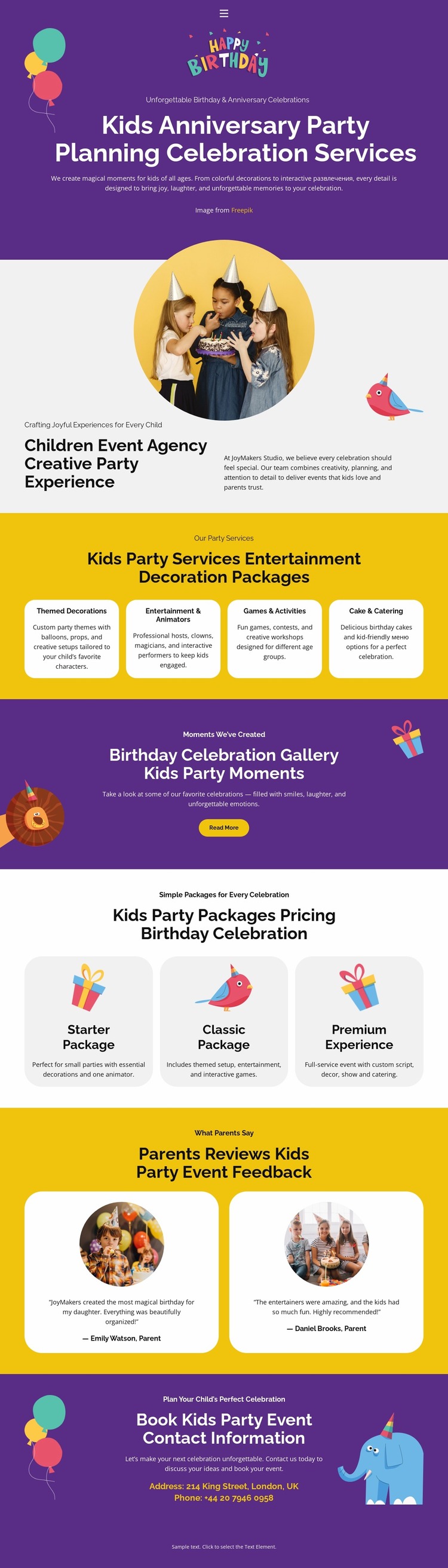
The full-width purple hero should be examined first as a visual presentation because its centered heading, supporting text, and decorative balloon artwork depend on enough space to remain balanced. At narrower widths, the relationship between the headline and the illustrated background may change, so the text scale, line wrapping, and empty space around the message deserve particular attention. The About Us section introduces a different review case: its text-and-circular-image arrangement must preserve a clear relationship when the available width becomes limited.
The four service cards and three package cards create the densest repeated areas on the page. On a wide view they read as organized groups, but narrower screens may stack them and substantially increase the page length. Review should focus on whether each card retains its hierarchy, whether labels remain readable, and whether the distinction between service categories and package choices stays visible. The circular photographs in the agency and testimonial sections should also be checked for cropping and scale.
The gallery promotion and final contact band use strong purple surfaces, while the booking area adds email and phone details. These regions should be compared across screen widths for text contrast, spacing, and contact readability. Nicepage’s Responsive Modes are relevant for this kind of visual evaluation, but the main evidence comes from the concrete design relationships that may shift as the viewport changes.
Customize with Nicepage
Open this ready-made template in the Website Mockup Builder and customize it visually in the Nicepage editor. Replace demo content, edit page sections, and adapt the design to your project without rebuilding the template from scratch.
Preview and Refine This Website Mockup
Review the Design Across Devices
Use Responsive Modes to see how the website design appears on Large Screens, Desktops, Laptops, Tablets, and Phones. Switch between the available views to compare the same layout at different screen widths and review how typography, images, spacing, navigation, and other content adapt to each device.
Adapt the Mockup for Different Screens
Nicepage provides responsive web design tools for adjusting individual device views when the initial layout needs refinement. You can customize Mobile Views separately, change element sizes and positions, adapt Grids, Lists, and Galleries, and hide selected Elements or Blocks on particular screen sizes. This makes it possible to develop a responsive website mockup instead of evaluating the design at only one fixed desktop size.
Preview the Website Without Editing Controls
Use Live Page / Preview to review the design with the editing interface removed from view. Instant Preview can hide the Page Navigator, Property Panel, selections, and frames, making it easier to evaluate the overall presentation, content hierarchy, and responsive layout as a visitor would see them.
This workflow makes the template useful as a responsive website mockup for visualizing, comparing, and refining how the same website design will appear across different screen sizes.