We are leaders in solar energy Website Mockup


Reviewing the Image Overlay and Three-Card Transition
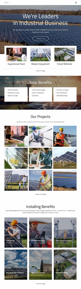
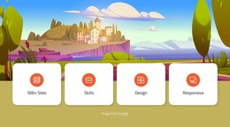
The full-width solar-panel photograph carries substantial visual weight, so the first mockup review point is the relationship between image scale and the centered white heading, supporting copy, and Contact Us button. If the image crops differently at narrower widths, the text must still sit over a usable area with sufficient contrast and breathing room. The message should remain visually connected to the photograph without being pushed into an excessively compressed overlay.
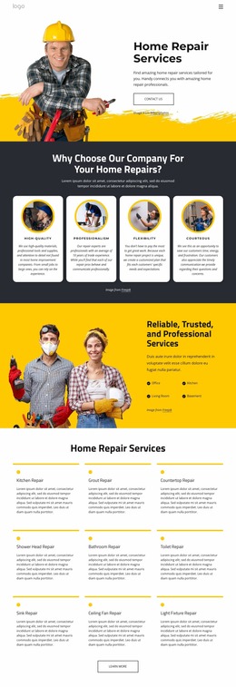
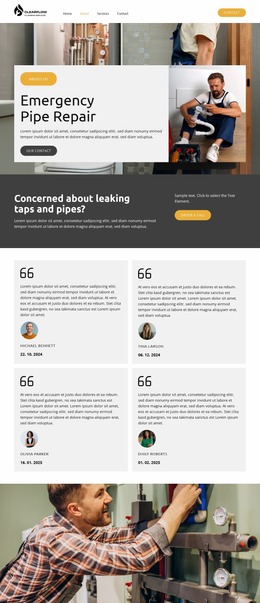
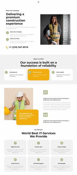
The lower transition deserves a separate check because three white cards overlap the image edge. At wide widths, the cards form an evenly spaced row with clear image-and-title pairings. As the section narrows, their widths, gaps, and possible stacking order should preserve the distinction between Experienced Team, Modern Equipment, and Smart Methods. The overlap should continue to read as an intentional bridge rather than an accidental collision with the background image. The repeated supporting images also need enough size to remain informative without making the section unnecessarily tall. Reviewing these relationships in a website mockup helps confirm that the block's central hierarchy survives changing screen widths: solar imagery first, centered capability message second, and three practical strengths below. The static interaction means visual adaptation, rather than control behavior, is the main presentation issue.
Customize with Nicepage
Open this ready-made template in the Website Mockup Builder and customize it visually in the Nicepage editor. Replace demo content, edit page sections, and adapt the design to your project without rebuilding the template from scratch.
Edit Template Offline
2. Create a new page or select existing
3. Click Add new block, search for id 6011087 and click enter
Edit Template Online
Create Awesome Websites


Free Nicepage Builder
Keywords
Review This Block as Part of a Responsive Website Mockup
Check the Section Across Devices
Use Responsive Modes to inspect how the block appears on Large Screens, Desktops, Laptops, Tablets, and Phones. Focus on the relationships that matter inside the section: column stacking, image scale, text wrapping, card density, spacing, form width, and alignment.
Adapt the Block for Narrower Screens
Nicepage provides responsive web design tools for adjusting individual device views. Refine sizes and positions, adapt Grids, Lists, and Galleries, and hide selected Elements or Blocks on particular screen sizes when the broader page requires it.
Preview the Section Without Editing Controls
Use Live Page / Preview to evaluate the design with editor controls removed. Review the block in the context of the surrounding page rather than treating one desktop screenshot as proof of all responsive states.
This workflow makes the block one responsive unit within a website mockup, with visual review focused on the section's own content relationships and how they adapt across screen widths.