Free analysis Website Mockup
Edit Template Offline
2. Create new page and search for id 6007426
Edit Template Online
Create Awesome Websites


Free Nicepage Builder
Keywords
The wide map, split panels, and compact form need responsive review
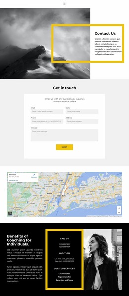
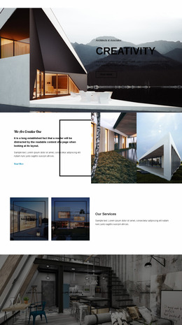
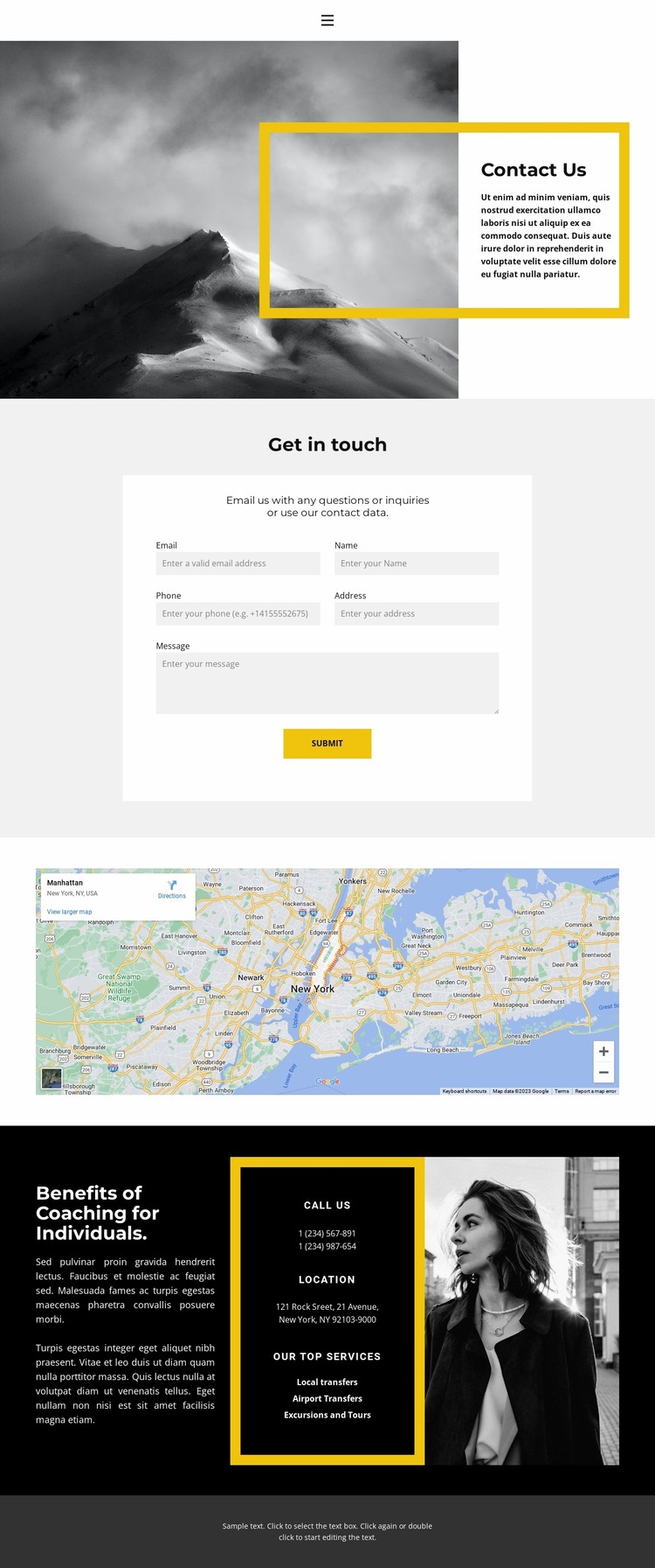
The opening split section is an important presentation area because it balances a large monochrome mountain image against a bordered text panel. At narrower widths, the relationship between image scale, panel width, heading size, and vertical spacing should be checked so the introduction remains legible without making either side feel compressed. The centered inquiry section presents a different review challenge: email, name, phone, address, and message inputs must retain clear labels and usable spacing as the form narrows.
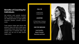
The wide map should also be examined for how its geographic content is framed on smaller screens. Its horizontal presentation may require careful attention to section width and surrounding padding so it remains a useful visual reference rather than an oversized or visually isolated strip. In the lower dark section, the three-part arrangement brings together explanatory text, a bordered contact-details panel, a services list, and a monochrome portrait. The order and relative scale of those elements can strongly affect the page’s visual balance when columns become more compact.
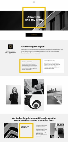
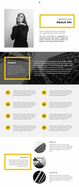
Mobile navigation, bold headings, and the centered footer deserve a final pass alongside the larger content areas. Reviewing the design as a website mockup is therefore less about changing its identity and more about checking image scale, form density, panel stacking, map visibility, and typography as the presentation moves between wide and narrow screens.
Customize with Nicepage
Open this ready-made template in the Website Mockup Builder and customize it visually in the Nicepage editor. Replace demo content, edit page sections, and adapt the design to your project without rebuilding the template from scratch.
Preview and Refine This Website Mockup
Review the Design Across Devices
Use Responsive Modes to see how the website design appears on Large Screens, Desktops, Laptops, Tablets, and Phones. Switch between the available views to compare the same layout at different screen widths and review how typography, images, spacing, navigation, and other content adapt to each device.
Adapt the Mockup for Different Screens
Nicepage provides responsive web design tools for adjusting individual device views when the initial layout needs refinement. You can customize Mobile Views separately, change element sizes and positions, adapt Grids, Lists, and Galleries, and hide selected Elements or Blocks on particular screen sizes. This makes it possible to develop a responsive website mockup instead of evaluating the design at only one fixed desktop size.
Preview the Website Without Editing Controls
Use Live Page / Preview to review the design with the editing interface removed from view. Instant Preview can hide the Page Navigator, Property Panel, selections, and frames, making it easier to evaluate the overall presentation, content hierarchy, and responsive layout as a visitor would see them.
This workflow makes the template useful as a responsive website mockup for visualizing, comparing, and refining how the same website design will appear across different screen sizes.