Local real estate agency Website Mockup
Edit Template Offline
2. Create new page and search for id 48825
Edit Template Online
Create Awesome Websites


Free Nicepage Builder
Keywords
Large Images and Dense Panels Define the Main Review Points
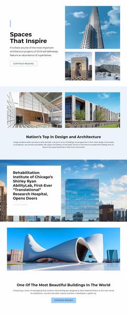
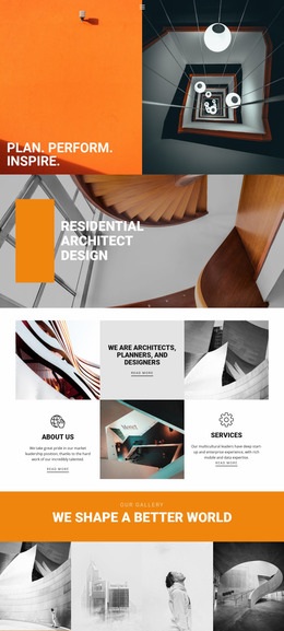
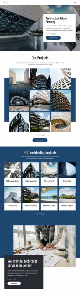
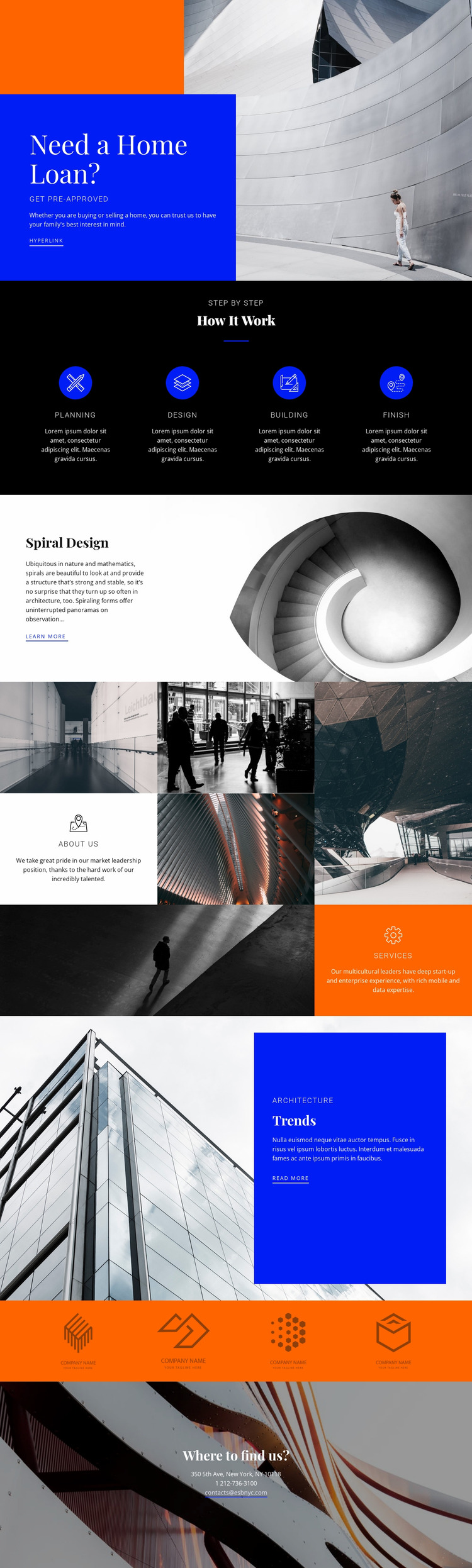
The opening hero should be examined as a relationship between image scale and concentrated copy. Its architectural photograph occupies a major visual role beside a vivid blue panel containing the home-loan headline, supporting text, pre-approval label, and action link. At narrower widths, the balance between the image and panel becomes especially important: the headline and CTA need to remain visually prominent without allowing the photograph to overwhelm the first response point.
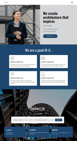
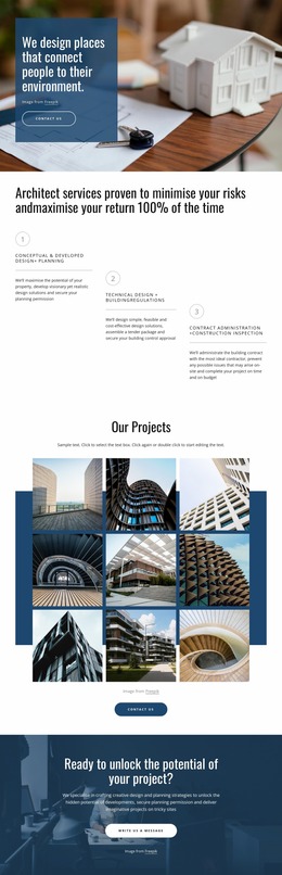
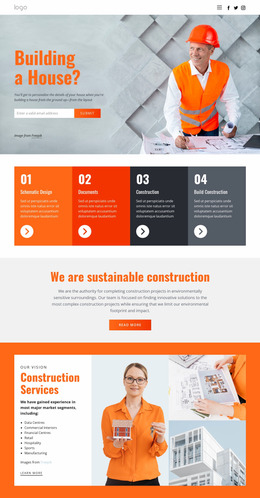
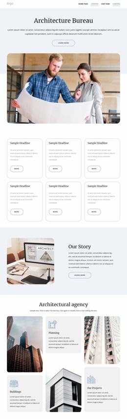
The four-item process row creates a second area for visual review. Planning, design, Building, and Finish are evenly distributed on a black background with circular icons, so changes in available width may affect spacing, label clarity, and the transition from a horizontal row to a more compact arrangement. The Spiral Design split section and Trends split section also require attention because each combines a large image with a text panel, but uses different imagery and color relationships.
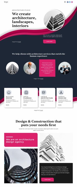
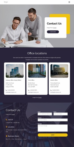
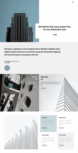
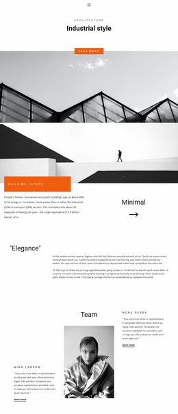
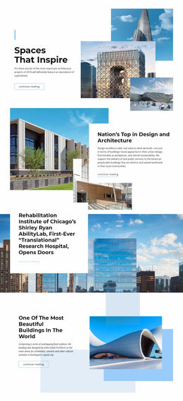
The image mosaic is likely to experience the greatest density change across screen conditions. Its architectural photographs are interleaved with About us and services cards, so image scale, card width, and reading order should be checked together rather than independently. The orange band with four marks and the dark “Where to find us?” background provide strong horizontal anchors near the end. Reviewing those anchors, the serif heading scale, contact-line spacing, and navigation or page flow helps evaluate the complete responsive presentation.
Customize with Nicepage
Open this ready-made template in the Website Mockup Builder and customize it visually in the Nicepage editor. Replace demo content, edit page sections, and adapt the design to your project without rebuilding the template from scratch.
Preview and Refine This Website Mockup
Review the Design Across Devices
Use Responsive Modes to see how the website design appears on Large Screens, Desktops, Laptops, Tablets, and Phones. Switch between the available views to compare the same layout at different screen widths and review how typography, images, spacing, navigation, and other content adapt to each device.
Adapt the Mockup for Different Screens
Nicepage provides responsive web design tools for adjusting individual device views when the initial layout needs refinement. You can customize Mobile Views separately, change element sizes and positions, adapt Grids, Lists, and Galleries, and hide selected Elements or Blocks on particular screen sizes. This makes it possible to develop a responsive website mockup instead of evaluating the design at only one fixed desktop size.
Preview the Website Without Editing Controls
Use Live Page / Preview to review the design with the editing interface removed from view. Instant Preview can hide the Page Navigator, Property Panel, selections, and frames, making it easier to evaluate the overall presentation, content hierarchy, and responsive layout as a visitor would see them.
This workflow makes the template useful as a responsive website mockup for visualizing, comparing, and refining how the same website design will appear across different screen sizes.