Camping vacation Website Mockup


Three Columns, Tall Images, and Overlay Text Need Responsive Review
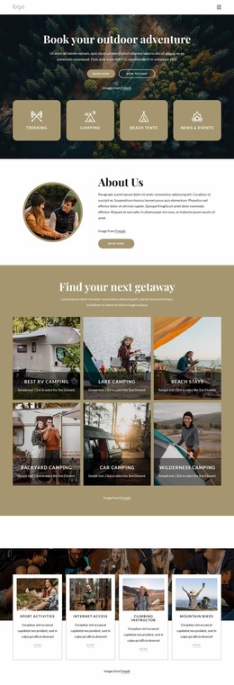
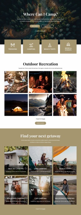
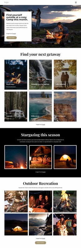
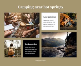
The gallery’s visual balance depends on the relationship between six tall photographs and the three-column arrangement. On a wide screen, Beach stays, Camping near hot springs, and Lake camping form one row, while Yosemite, Yellowstone, and Bryce Canyon form the next. The equal card sizes create a regular rhythm, but the images still carry most of the visual weight, so their crop and scale deserve attention when the available width changes.
At narrower screen sizes, the key review point is how the three-column grid reorganizes. If the cards stack or reduce their column count, the section may become much longer, and the centered “Find your next getaway” heading may sit farther from the final image credit. The bottom-aligned white text must remain inside each image area, with enough overlay contrast for labels such as Yosemite, Yellowstone, and Bryce Canyon and their California, Wyoming, and Utah references to remain legible. Divider lines should continue to separate image and text treatment without creating visual clutter.
The static interaction makes the review focused on presentation rather than controls or motion. In a website mockup, compare the section at wide and narrow widths as a complete gallery unit: check card order, image emphasis, text wrapping, spacing between rows, and the relationship of the credit line to the final cards.
Customize with Nicepage
Open this ready-made template in the Website Mockup Builder and customize it visually in the Nicepage editor. Replace demo content, edit page sections, and adapt the design to your project without rebuilding the template from scratch.
Edit Template Offline
2. Create a new page or select existing
3. Click Add new block, search for id 4528918 and click enter
Edit Template Online
Create Awesome Websites


Free Nicepage Builder
Keywords
Preview and Refine This Website Mockup
Review the Design Across Devices
Use Responsive Modes to see how the website design appears on Large Screens, Desktops, Laptops, Tablets, and Phones. Switch between the available views to compare the same layout at different screen widths and review how typography, images, spacing, navigation, and other content adapt to each device.
Adapt the Mockup for Different Screens
Nicepage provides responsive web design tools for adjusting individual device views when the initial layout needs refinement. You can customize Mobile Views separately, change element sizes and positions, adapt Grids, Lists, and Galleries, and hide selected Elements or Blocks on particular screen sizes. This makes it possible to develop a responsive website mockup instead of evaluating the design at only one fixed desktop size.
Preview the Website Without Editing Controls
Use Live Page / Preview to review the design with the editing interface removed from view. Instant Preview can hide the Page Navigator, Property Panel, selections, and frames, making it easier to evaluate the overall presentation, content hierarchy, and responsive layout as a visitor would see them.
This workflow makes the template useful as a responsive website mockup for visualizing, comparing, and refining how the same website design will appear across different screen sizes.