
Hospice history Website Mockup


Text Flow and Panel Stacking Define the Responsive Review
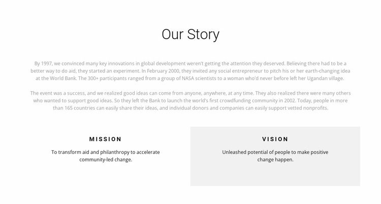
The upper portion of the block depends on a centered “Our Story” heading above a wide, long-form narrative. In a website mockup, review how that paragraph flow changes as the available width narrows: lines may become longer vertically, and the historical sequence—from global development origins and the 2000 World Bank event to the community’s 2002 launch—may occupy more of the section’s height. The centered heading should continue to introduce the text without being visually separated from it.
The lower two-column row is the second important review area. Mission and vision are presented as adjacent panels on wider screens, with uppercase labels and separate statements. The vision panel’s light gray background helps preserve the distinction between the two principles, but its contrast should remain balanced when the panels change width or stack. Check that neither statement appears visually subordinate simply because one panel receives less horizontal space.
The block is static, so responsive evaluation focuses on reading order, wrapping, spacing, and panel balance rather than controls or transitions. A useful mockup review should confirm that the narrative remains comfortable to read and that the mission-to-vision relationship survives narrower layouts. The section should still feel like one progression from story to principles across the surrounding page.
Customize with Nicepage
Open this ready-made template in the Website Mockup Builder and customize it visually in the Nicepage editor. Replace demo content, edit page sections, and adapt the design to your project without rebuilding the template from scratch.
Edit Template Offline
2. Create a new page or select existing
3. Click Add new block, search for id 343724 and click enter
Edit Template Online
Create Awesome Websites


Free Nicepage Builder
Keywords
Review This Block as Part of a Responsive Website Mockup
Check the Section Across Devices
Use Responsive Modes to inspect how the block appears on Large Screens, Desktops, Laptops, Tablets, and Phones. Focus on the relationships that matter inside the section: column stacking, image scale, text wrapping, card density, spacing, form width, and alignment.
Adapt the Block for Narrower Screens
Nicepage provides responsive web design tools for adjusting individual device views. Refine sizes and positions, adapt Grids, Lists, and Galleries, and hide selected Elements or Blocks on particular screen sizes when the broader page requires it.
Preview the Section Without Editing Controls
Use Live Page / Preview to evaluate the design with editor controls removed. Review the block in the context of the surrounding page rather than treating one desktop screenshot as proof of all responsive states.
This workflow makes the block one responsive unit within a website mockup, with visual review focused on the section's own content relationships and how they adapt across screen widths.