Compare plans and prices Web Page Design


The Left Label Column Anchors a Balanced Two-Plan Composition
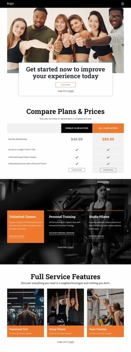
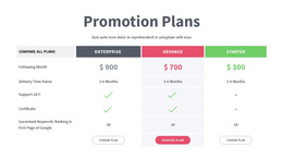
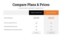
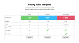
The block’s page composition is built around a simple spatial relationship: a centered introductory group leads into a wide table whose feature labels remain on the left while two plan columns occupy the stronger visual area on the right. This arrangement lets the visitor establish the comparison subject before reading across the rows. The four-row structure then aligns monthly membership with three benefits, including Home Club access, unlimited group fitness classes, and an onboarding session with a personal trainer.
The two plan headers create the table’s upper anchors, while repeated checkmarks maintain a steady vertical rhythm through the comparison area. At the bottom, the choose-plan buttons provide a paired closing line, keeping the action points aligned with the plans above them. The black and orange fills separate the columns, and light-gray emphasis in the right column adds visual weight without disturbing the left-to-right reading path. Thin white dividers make the rows legible as distinct bands.
Within one webpage, this block can function as a concentrated middle or lower-page composition between explanatory content and another supporting section. Its role comes from spatial organization rather than from site-wide styling: centered introduction, broad comparison table, repeated row alignment, and paired actions. The static interaction keeps the entire comparison available in one view, allowing the surrounding page to provide context while this section handles plan information.
Customize with Nicepage
Open this ready-made template in the Web Page Design Builder and customize it visually in the Nicepage editor. Replace demo content, edit page sections, and adapt the design to your project without rebuilding the template from scratch.
Edit Template Offline
2. Create a new page or select existing
3. Click Add new block, search for id 6211097 and click enter
Edit Template Online
Create Awesome Websites


Free Nicepage Builder
Keywords
Design a Web Page Section by Section
Choose a Design for Each Section
Build the page from individual content sections instead of starting with a fixed full-page layout. Use Block Designs to browse ready-made sections for different purposes, including introductions, services, galleries, testimonials, contact forms, pricing, and other common parts of a web page. Search or filter the available designs to find a layout that fits the content you want to add.
Combine Blocks and Page Elements
Add selected Blocks to the page and arrange them in the order that supports the page's purpose. A hero section can introduce the main message, followed by services, benefits, portfolio content, testimonials, calls to action, or contact information.
Inside each section, use Web Page Elements such as Text, Image, Hyperlink, Grid, Gallery, and other elements to build and present the page content. Individual elements can be added and adjusted within the Blocks, giving you more control over the composition of each section without having to create the complete layout from scratch.
Refine the Page Layout and Flow
After assembling the main sections, adjust their content, spacing, backgrounds, images, typography, and element placement in the Nicepage editor. Reorder Blocks when necessary and refine the transition from one section to the next so the information hierarchy and visual flow remain clear throughout the page.
This workflow makes the template useful as a web page design that can be composed from ready-made sections, customized with individual page elements, rearranged, and adapted to the content and purpose of an individual page.