Online study for kids One Page Template


Online Study Reads as Two Connected Content Destinations
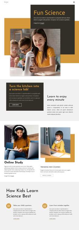
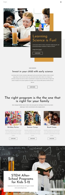
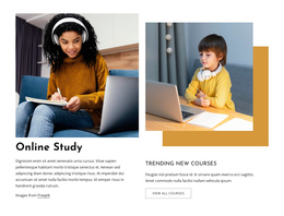
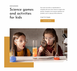
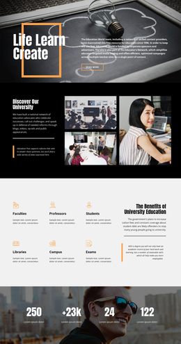
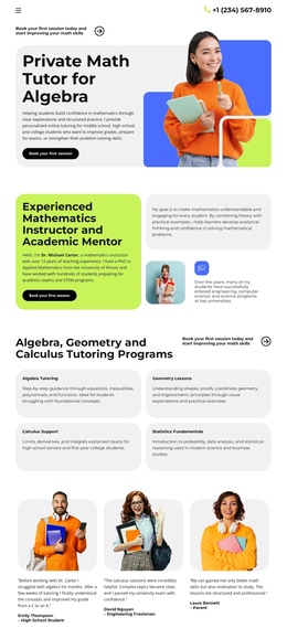
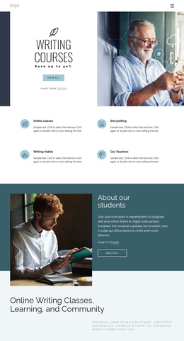
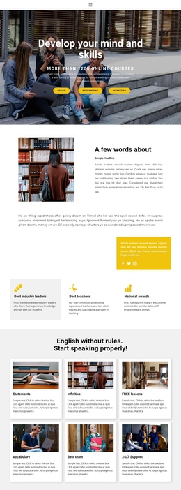
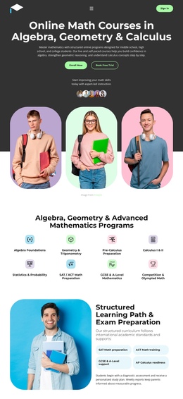
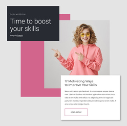
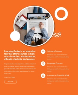
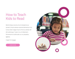
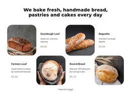
The Online Study heading gives the left column a clear subject, supported by an educational image and paragraph that can introduce the wider learning experience. The right column provides a second destination within the same block: Trending New Courses combines its own image, course-focused text, mustard-gold accent, and View all courses button. These areas work together, but they do not duplicate one another. One establishes context, while the other offers a route toward more course information.
The split composition makes the section easy to recognize as visitors move through a longer page. The two offset rectangular images create asymmetrical balance, and the white space around the headings keeps each content group visually distinct. Black typography supplies consistent hierarchy, while the gold accent gives the course area a noticeable marker without overwhelming the introduction. Since the block is static, its identity comes from its content grouping and visual arrangement.
Within a one-page experience, this section can sit between an opening education statement and later destinations such as detailed offerings, student information, or contact content. The View all courses action can lead visitors toward the relevant course destination, while page-level navigation remains the responsibility of the containing page. Nicepage’s Menu For One-Page Site can provide that broader navigation context when the project needs it, without changing this block’s role as one section.
Customize with Nicepage
Open this ready-made template in the One Page Template Builder and customize it visually in the Nicepage editor. Replace demo content, edit page sections, and adapt the design to your project without rebuilding the template from scratch.
Edit Template Offline
2. Create a new page or select existing
3. Click Add new block, search for id 343338 and click enter
Edit Template Online
Create Awesome Websites


Free Nicepage Builder
Keywords
Build a Navigable One-Page Website
Connect the Menu to Page Sections
Organize the website as a sequence of sections on a single page and use the Menu For One-Page Site to connect menu items with individual page Blocks. Visitors can jump directly to sections such as About, Services, Testimonials, or Contact without opening separate pages.
Keep the Website on One URL
A one-page template can combine several parts of a small website within one continuous page. Arrange the Header, introduction, services, portfolio, company information, reviews, contact details, and other relevant sections in the order that fits the project while keeping them accessible through the same page navigation.
Make Long Pages Easier to Navigate
For longer one-page websites, keep navigation labels short and connected to meaningful sections so visitors can move through the page without relying only on scrolling. You can also use the Back To Top element to provide a quick way back to the beginning after longer sections.
This workflow makes the template suitable for compact websites that need several distinct content sections while keeping the complete visitor experience on one URL.