Online and portable versions One Page Template


Parallel Access Choices Make a Recognizable Page Section
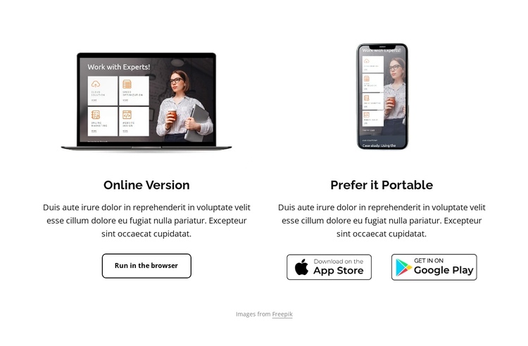
The section can act as one clear information destination within a continuous page because its two columns answer a specific question: how should the application be accessed? The laptop image and “Online Version” heading establish the first content group, followed by supporting copy and the “Run in the browser” action. Together, these elements give the browser option a complete visual identity within the section.
The smartphone image introduces the second group and changes the emphasis from immediate browser use to portability. “Prefer it Portable” names that destination, while the App Store and Google Play badges provide recognizable endpoints for the download choice. The repeated column structure connects the options, but the different imagery and action treatments keep them distinct.
In a one-page experience, this block could sit after an application introduction or feature explanation and before later proof, pricing, or contact content. Its role is informational and navigational: it marks a meaningful stop in the page journey rather than attempting to contain every page function. The centered alignment, white field, and open spacing help visitors identify the access section as they move through neighboring blocks, while the existing action and badges preserve the section’s two-route purpose.
Customize with Nicepage
Open this ready-made template in the One Page Template Builder and customize it visually in the Nicepage editor. Replace demo content, edit page sections, and adapt the design to your project without rebuilding the template from scratch.
Edit Template Offline
2. Create a new page or select existing
3. Click Add new block, search for id 3408963 and click enter
Edit Template Online
Create Awesome Websites


Free Nicepage Builder
Keywords
Build a Navigable One-Page Website
Connect the Menu to Page Sections
Organize the website as a sequence of sections on a single page and use the Menu For One-Page Site to connect menu items with individual page Blocks. Visitors can jump directly to sections such as About, Services, Testimonials, or Contact without opening separate pages.
Keep the Website on One URL
A one-page template can combine several parts of a small website within one continuous page. Arrange the Header, introduction, services, portfolio, company information, reviews, contact details, and other relevant sections in the order that fits the project while keeping them accessible through the same page navigation.
Make Long Pages Easier to Navigate
For longer one-page websites, keep navigation labels short and connected to meaningful sections so visitors can move through the page without relying only on scrolling. You can also use the Back To Top element to provide a quick way back to the beginning after longer sections.
This workflow makes the template suitable for compact websites that need several distinct content sections while keeping the complete visitor experience on one URL.