Choose a comfortable tariff One Page Template


A Two-Plan Comparison Gives the Page a Distinct Pricing Destination
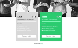
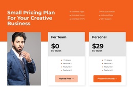
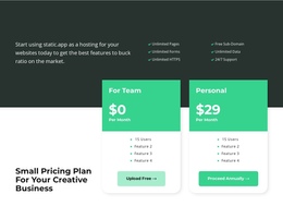
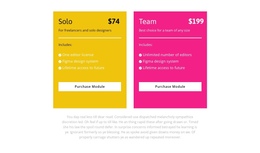
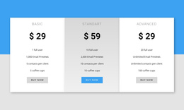
The two cards create a clear information destination within a continuous page because they answer one focused question: how the available plans differ. Solo presents a $74 option with one editor license, while Team presents a $199 option with unlimited editors. Their shared Figma design system and lifetime access to future content make the comparison easier to scan, since visitors can separate common inclusions from the difference in editor capacity.
The section also has a strong visual boundary. A wide monochrome photograph occupies the upper area, and the pricing cards overlap its lower edge before meeting the white area beneath. That image-to-card relationship can help the pricing destination stand apart from neighboring introductory, feature, or product sections without requiring the block to become a separate page. The light gray and bright green backgrounds distinguish the two destinations inside the comparison itself.
Each card finishes with a Purchase Module button, so the section can connect plan evaluation with the next part of a visitor’s page journey. The surrounding one-page experience can place this comparison after explanatory content and before other supporting information. If section navigation is added at page level, the block offers a meaningful pricing target; the block itself supplies the content destination, while the broader page supplies the continuous flow.
Customize with Nicepage
Open this ready-made template in the One Page Template Builder and customize it visually in the Nicepage editor. Replace demo content, edit page sections, and adapt the design to your project without rebuilding the template from scratch.
Edit Template Offline
2. Create a new page or select existing
3. Click Add new block, search for id 3097934 and click enter
Edit Template Online
Create Awesome Websites


Free Nicepage Builder
Keywords
Build a Navigable One-Page Website
Connect the Menu to Page Sections
Organize the website as a sequence of sections on a single page and use the Menu For One-Page Site to connect menu items with individual page Blocks. Visitors can jump directly to sections such as About, Services, Testimonials, or Contact without opening separate pages.
Keep the Website on One URL
A one-page template can combine several parts of a small website within one continuous page. Arrange the Header, introduction, services, portfolio, company information, reviews, contact details, and other relevant sections in the order that fits the project while keeping them accessible through the same page navigation.
Make Long Pages Easier to Navigate
For longer one-page websites, keep navigation labels short and connected to meaningful sections so visitors can move through the page without relying only on scrolling. You can also use the Back To Top element to provide a quick way back to the beginning after longer sections.
This workflow makes the template suitable for compact websites that need several distinct content sections while keeping the complete visitor experience on one URL.