Professional Stock Broker Landing Page
Edit Template Offline
2. Create new page and search for id 6669826
Edit Template Online
Create Awesome Websites


Free Nicepage Builder
Keywords
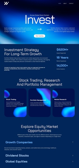
The Start Investing Message Leads into Proof, Choice, and Response
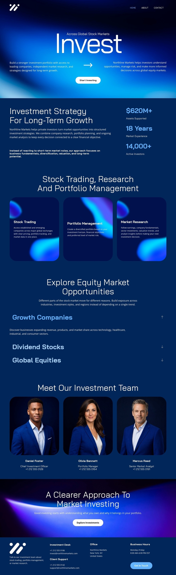
The hero establishes the first response path with the “Invest” headline and Start Investing button over a dark blue gradient. Instead of leaving that action unsupported, the next section explains an investment strategy for long-term growth and places three displayed figures beside the narrative. These figures are structural presentation elements rather than independently verified financial results, but their position shows how the page uses quantified-looking proof to support the message before visitors evaluate specific services.
The three capability cards then clarify what the investment offer covers: Stock Trading, Portfolio Management, and Market Research. The expandable equity rows add choice without breaking the central journey, allowing Growth Companies, Dividend Stocks, and Global Equities to be introduced as related opportunity categories. The team section follows with three portrait cards, giving the page a human context before the vivid “A Clearer Approach To Market Investing” band returns attention to the Explore Investments button. That sequence moves from initial promise to strategy, service explanation, opportunity categories, people, and a second response point. The footer preserves contact and navigation access, but the two prominent investment actions remain the strongest campaign signals. As a landing page, the design works through progression toward starting or exploring an investment relationship rather than through a broad multi-page site structure.
Customize with Nicepage
Open this ready-made template in the Landing Page Builder and customize it visually in the Nicepage editor. Replace demo content, edit page sections, and adapt the design to your project without rebuilding the template from scratch.
Build a Landing Page Around One Conversion Goal
Focus on One Primary Action
Use the landing page to guide visitors toward one measurable response, such as requesting a quote, registering, subscribing, booking a consultation, applying for a service, or submitting an inquiry. Keep the primary call-to-action consistent across the important sections so the headline, supporting content, form, and CTA buttons work toward the same campaign goal instead of competing for attention.
Capture Leads With a Form
Use the Contact Form Element to add a contact, subscription, application, or other conversion form directly to the landing page. Customize the form fields, layout, labels, inputs, and button to collect the information required for your campaign while keeping the form focused on the action you want visitors to complete.
Nicepage also provides several form submission options. Form submissions can be sent to Email, stored as Leads, added to Google Sheets, passed to a custom URL or server endpoint, or used to populate a MailChimp mailing list. This provides practical options for collecting inquiries, registrations, subscriptions, applications, and other campaign responses.
Manage Leads and Campaign Responses
When submissions are stored as Leads, you can use Contact Form Leads to review the information collected through the landing page and use it for follow-up. Keep the form connected to the same offer and primary CTA presented throughout the page so visitors move from the campaign message to a clear conversion action.
This workflow makes the template suitable for landing pages where the offer, content, call-to-action, form, and lead collection process work together toward one defined conversion goal.

More from Business & Law Landing Pages
-
Free Website Builder SoftwareDownload