Leader in technology Landing Page
Edit Template Offline
2. Create new page and search for id 17226
Edit Template Online
Create Awesome Websites


Free Nicepage Builder
Keywords
The Product Story Builds Interest Through Comparison and Proof
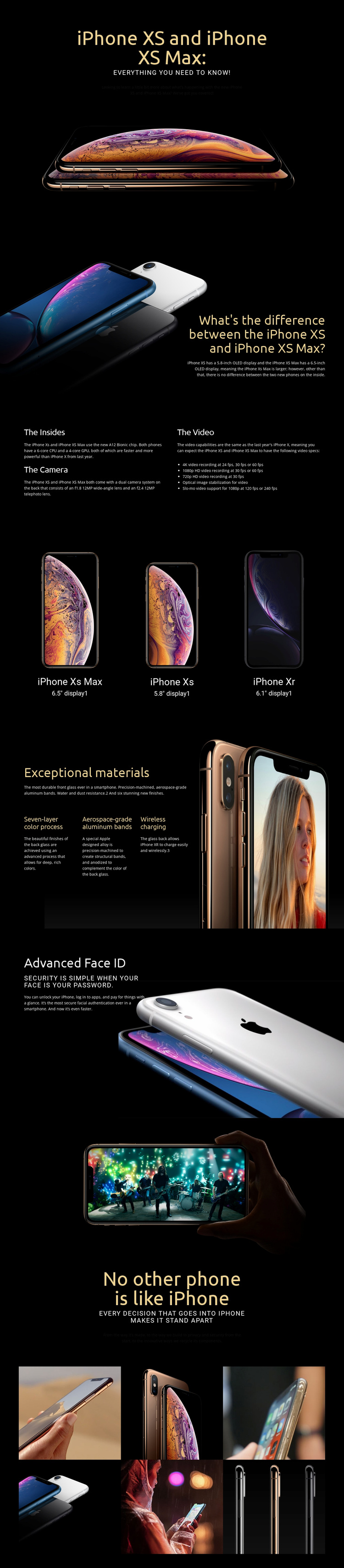
The page begins with a strong subject introduction: iPhone XS and iPhone XS Max appear in a dark, image-led hero with a large headline and supporting explanation. The next section narrows the message to a specific question about the difference between the two models, using display size as an accessible comparison point. This opening sequence can help visitors understand what is being presented before they reach the denser technical material.
The middle sections provide supporting product evidence rather than repeating the introduction. “The Insides” explains the A12 Bionic chip, dual camera system, and video capabilities, including 4K, 1080p HD, and 720p recording. The three-item product display broadens the comparison by showing iPhone XS Max, iPhone XS, and iPhone XR together with their 6.5-inch, 5.8-inch, and 6.1-inch display labels. That section gives the visitor a concise visual reference for the models discussed on the page.
The final product-focused blocks add materials, wireless charging, and Advanced Face ID, followed by broader statements about privacy, security, and recycling. Because no primary conversion action is verified, the design should be interpreted conservatively as an informative product page rather than a confirmed sales or lead-generation funnel. Its strongest response path is continued product understanding: image, comparison, technical explanation, construction, security, and a closing gallery. Any later action should remain secondary to that informational sequence.
Customize with Nicepage
Open this ready-made template in the Landing Page Builder and customize it visually in the Nicepage editor. Replace demo content, edit page sections, and adapt the design to your project without rebuilding the template from scratch.
Build a Landing Page Around One Conversion Goal
Focus on One Primary Action
Use the landing page to guide visitors toward one measurable response, such as requesting a quote, registering, subscribing, booking a consultation, applying for a service, or submitting an inquiry. Keep the primary call-to-action consistent across the important sections so the headline, supporting content, form, and CTA buttons work toward the same campaign goal instead of competing for attention.
Capture Leads With a Form
Use the Contact Form Element to add a contact, subscription, application, or other conversion form directly to the landing page. Customize the form fields, layout, labels, inputs, and button to collect the information required for your campaign while keeping the form focused on the action you want visitors to complete.
Nicepage also provides several form submission options. Form submissions can be sent to Email, stored as Leads, added to Google Sheets, passed to a custom URL or server endpoint, or used to populate a MailChimp mailing list. This provides practical options for collecting inquiries, registrations, subscriptions, applications, and other campaign responses.
Manage Leads and Campaign Responses
When submissions are stored as Leads, you can use Contact Form Leads to review the information collected through the landing page and use it for follow-up. Keep the form connected to the same offer and primary CTA presented throughout the page so visitors move from the campaign message to a clear conversion action.
This workflow makes the template suitable for landing pages where the offer, content, call-to-action, form, and lead collection process work together toward one defined conversion goal.

More from Technology Landing Pages
-
Free Website Builder SoftwareDownload