Beats Wireless Landing Page
Edit Template Offline
2. Create new page and search for id 24285
Edit Template Online
Create Awesome Websites


Free Nicepage Builder
Keywords
Product Evidence Leads Readers Toward Further Review Content
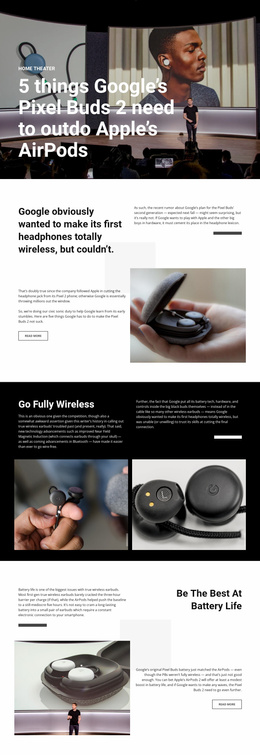
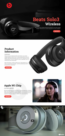
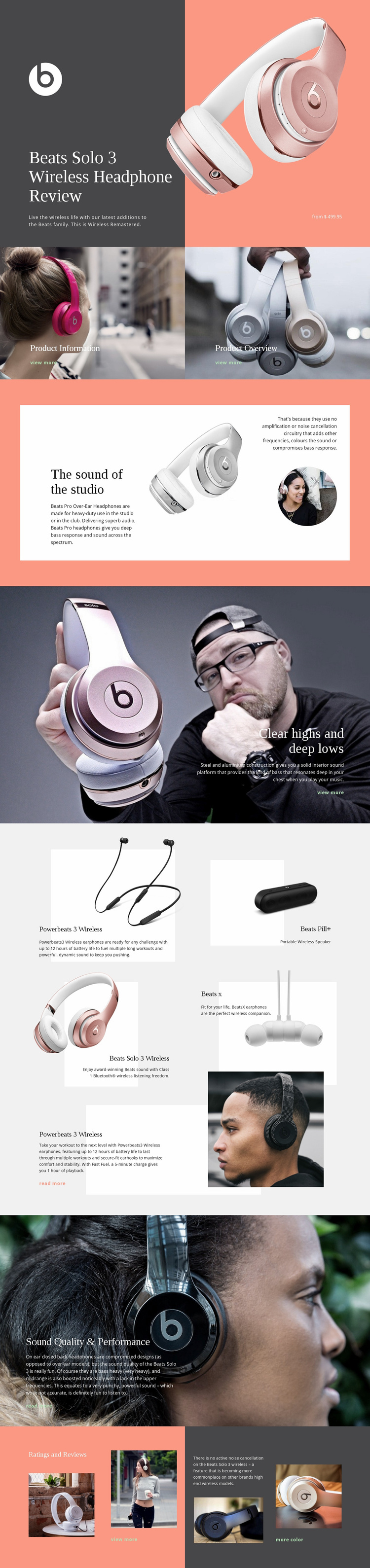
The page begins with a strong product-specific impression: Beats Solo 3 Wireless headphones appear beside a dark panel carrying the review title, summary, brand mark, and displayed price. That combination establishes what is being evaluated before readers encounter supporting detail. The two image-led tiles immediately below, labeled Product Information and Product Overview, then offer visible routes into more product-focused content through their view-more links.
The middle sections can support a measured information path rather than presenting an unexplained sales claim. “The sound of the studio” introduces the audio subject through a split text-and-image arrangement, while “Clear highs and deep lows” develops the discussion through construction and bass commentary over a full-width photograph. The Sound Quality & Performance section continues that evidence-led sequence with review commentary and a read-more link. Together, these sections give readers reasons to keep moving through the review before they reach the closing evaluation.
The related-product Grid Repeater broadens the response opportunity by showing Powerbeats 3 Wireless, Beats Pill+, Beats Solo 3 Wireless, and Beats X as five image-and-description cards. The final Ratings and Reviews section adds rating imagery, noise-cancellation commentary, product photographs, and a more-color link. Because the verified page goal is further product information or reading rather than one confirmed purchase action, the design should be treated as a focused information path, with view-more and read-more actions carrying the next response step.
Customize with Nicepage
Open this ready-made template in the Landing Page Builder and customize it visually in the Nicepage editor. Replace demo content, edit page sections, and adapt the design to your project without rebuilding the template from scratch.
Build a Landing Page Around One Conversion Goal
Focus on One Primary Action
Use the landing page to guide visitors toward one measurable response, such as requesting a quote, registering, subscribing, booking a consultation, applying for a service, or submitting an inquiry. Keep the primary call-to-action consistent across the important sections so the headline, supporting content, form, and CTA buttons work toward the same campaign goal instead of competing for attention.
Capture Leads With a Form
Use the Contact Form Element to add a contact, subscription, application, or other conversion form directly to the landing page. Customize the form fields, layout, labels, inputs, and button to collect the information required for your campaign while keeping the form focused on the action you want visitors to complete.
Nicepage also provides several form submission options. Form submissions can be sent to Email, stored as Leads, added to Google Sheets, passed to a custom URL or server endpoint, or used to populate a MailChimp mailing list. This provides practical options for collecting inquiries, registrations, subscriptions, applications, and other campaign responses.
Manage Leads and Campaign Responses
When submissions are stored as Leads, you can use Contact Form Leads to review the information collected through the landing page and use it for follow-up. Keep the form connected to the same offer and primary CTA presented throughout the page so visitors move from the campaign message to a clear conversion action.
This workflow makes the template suitable for landing pages where the offer, content, call-to-action, form, and lead collection process work together toward one defined conversion goal.

More from Technology Landing Pages
-
Free Website Builder SoftwareDownload