Fresh bread baked daily Html Code Example


Six Product Cards Create Clear Extension Regions
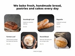
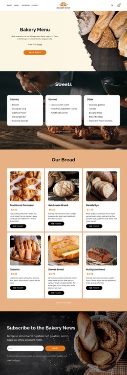
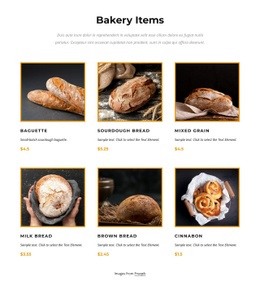
The six bread cards already define the section’s main content boundaries: each one pairs a square product image with a product name, displayed price, and Add to Cart action. The centered introduction sits above this repeated grid, so any project-specific extension should remain connected to an appropriate product region or the surrounding product message rather than replacing the block’s organization. The three-column arrangement across two rows also makes the card pattern easy to identify as separate content units.
In an HTML Code context, these regions can serve as logical places for optional custom functionality when the surrounding project requires something beyond the existing static presentation. For example, a project might need an external inventory indicator, product information widget, or custom data connection associated with a card. Such an addition would be a potential extension around the verified product content; it is not part of the block’s current interaction model, which is static apart from the visible Add to Cart actions.
The section should remain the visual and content base. Its “Our Bread” heading, six named products, prices, image treatment, and purchase controls already communicate the selection. Custom markup can support a specific integration while leaving the centered introduction, repeated card relationships, Freepik credit, and two-row grid intact.
Customize with Nicepage
Open this ready-made template in the HTML Code Generator and customize it visually in the Nicepage editor. Replace demo content, edit page sections, and adapt the design to your project without rebuilding the template from scratch.
Edit Template Offline
2. Create a new page or select existing
3. Click Add new block, search for id 6459301 and click enter
Edit Template Online
Create Awesome Websites


Free Nicepage Builder
Keywords
Extend This Page With Custom HTML Code
Insert Code With the HTML Element
Use the HTML Element to add custom code directly to a Block in the Nicepage editor. Enter the required markup in the Code field when the page needs content or functionality that is not available through the standard page elements.
Place the HTML Element in the Layout
Treat the HTML Element as part of the visual page composition. Adjust its position, width, height, alignment, and margins to place the custom content where it belongs alongside text, images, buttons, and other elements. This makes it possible to combine visually edited sections with project-specific code without separating the custom element from the rest of the layout.
Add HTML, CSS, JavaScript, and External Components
The HTML Element supports HTML, CSS, and JavaScript, allowing you to extend the page with custom markup and interactive functionality. It can also be used to embed custom code and third-party components, such as social feeds, advertising code, widgets, or other external functionality required by the project.
This workflow makes the template useful for projects that need a visual page editor together with custom HTML code, JavaScript, embedded components, and functionality beyond the standard page elements.

Design Set (22)
-

-
-
-
Customize Any TemplateDownload
-
-
-
-
-
-
-
-
-
-
-
-











More from Food & Restaurant Blocks
-

-
-
-
-
-
-
-
-
-
-
Customize Any TemplateDownload
-
-
-
-
-
-
-
-
-
-












More from Product List Blocks
-

-
-
-
-
-
-
-
-
-
-
Customize Any TemplateDownload
-
-
-
-
-
-
-
-
-
-