Increase your website traffic Html Code Example


Four Card Regions Leave Room for Targeted Extensions
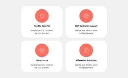
The four cards already establish a complete feature-highlights arrangement: each one places a coral circular icon above a title and supporting paragraph, while the two-by-two grid keeps the repeated information evenly distributed. White rounded surfaces distinguish the cards from the light gray section background, and generous spacing prevents the centered text from becoming a dense cluster. The titles—Flexible benefits, 24/7 Dedicated support, 100% Secure, and Affordable Price Plan—also create four clearly bounded content regions.
That separation can be useful when a project needs to extend one feature area with custom content or an external component. For example, a data-driven detail, an availability indicator, or another project-specific element could be associated with a relevant card without replacing the overall grid. The circular icon, title, and paragraph would continue to carry the primary visual explanation, while any added markup could remain within or beside the selected card according to the intended composition.
The block does not contain a confirmed interactive component, so custom HTML should be treated as an optional extension rather than an existing function. Its strongest starting point is the stable relationship between repeated cards and their centered content: additions can be localized to one feature region while the other three preserve the same visual pattern.
Customize with Nicepage
Open this ready-made template in the HTML Code Generator and customize it visually in the Nicepage editor. Replace demo content, edit page sections, and adapt the design to your project without rebuilding the template from scratch.
Edit Template Offline
2. Create a new page or select existing
3. Click Add new block, search for id 4533047 and click enter
Edit Template Online
Create Awesome Websites


Free Nicepage Builder
Keywords
Extend This Page With Custom HTML Code
Insert Code With the HTML Element
Use the HTML Element to add custom code directly to a Block in the Nicepage editor. Enter the required markup in the Code field when the page needs content or functionality that is not available through the standard page elements.
Place the HTML Element in the Layout
Treat the HTML Element as part of the visual page composition. Adjust its position, width, height, alignment, and margins to place the custom content where it belongs alongside text, images, buttons, and other elements. This makes it possible to combine visually edited sections with project-specific code without separating the custom element from the rest of the layout.
Add HTML, CSS, JavaScript, and External Components
The HTML Element supports HTML, CSS, and JavaScript, allowing you to extend the page with custom markup and interactive functionality. It can also be used to embed custom code and third-party components, such as social feeds, advertising code, widgets, or other external functionality required by the project.
This workflow makes the template useful for projects that need a visual page editor together with custom HTML code, JavaScript, embedded components, and functionality beyond the standard page elements.

Design Set (16)












More from Features Blocks
-

-

-
-
-
-
-
-
-
-
-
Customize Any TemplateDownload
-
-
-
-
-
-
-
-
-
-