Hosting plan HTML5 Template


A Centered Introduction Leads Into Three Repeated Plan Groups
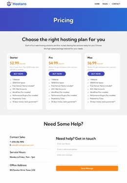
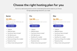
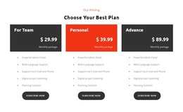
The section is organized in two main levels. First, the centered heading and compact supporting paragraph introduce the comparison and establish the question the cards answer. Second, the three-column row contains three peer content groups: Starter, Pro, and Max. Each group follows the same internal sequence of plan identity, monthly price, description, included features, and purchase action.
The repeated hierarchy makes the pricing data easier to compare. The prices are $2.99, $4.99, and $6.99 per month, while the feature details distinguish 30GB, 50GB, and 100GB of disk space and 10, 20, and 40 email accounts. Other listed details—one website, a free domain, pre-installed WordPress, performance plugins, Turbo support, and a 30-day money-back guarantee—fit within the feature-list layer of each card. The parallel card pattern also keeps plan-level information in predictable positions.
This HTML5 Template angle concerns the organization inside the block, not a full document hierarchy. The light gray background surrounds the section, and the white rounded cards establish three visually separate but structurally parallel containers. That arrangement gives each plan its own content group while preserving the comparison as one reusable section.
Customize with Nicepage
Open this ready-made template in the HTML5 Template Builder and customize it visually in the Nicepage editor. Replace demo content, edit page sections, and adapt the design to your project without rebuilding the template from scratch.
Edit Template Offline
2. Create a new page or select existing
3. Click Add new block, search for id 6513654 and click enter
Edit Template Online
Create Awesome Websites


Free Nicepage Builder
Keywords
Explore This HTML5 Template Structure
Navigate the Page Structure
Customize this ready-made HTML5 template visually in the Nicepage editor while keeping its page organization easy to understand. Use the Layers panel to view the hierarchy of the Header, Blocks, Containers, Elements, and Footer, navigate between different parts of the page, and quickly select items within the layout.
The Layers panel also provides practical controls for working with more complex pages. Blocks, Containers, and Elements can be renamed for easier identification, temporarily hidden while editing, or locked to prevent accidental changes. The outline can also expose the internal structure of elements such as Menus and Contact Forms.
Work With Organized Page Sections
Blocks divide the page into major content sections, while Containers and Elements organize the content inside them. Keeping this hierarchy visible makes it easier to understand how individual parts of the page relate to one another, especially when a layout contains many nested elements.
You can use the Layers panel to move through this structure instead of selecting everything directly on the canvas, making complex layouts easier to inspect and manage as an organized page hierarchy.
Review and Extend the HTML
After customizing the page visually, the resulting HTML can be reviewed and adapted when code-level changes are required. If a project needs additional markup or functionality beyond the standard page elements, use the HTML Element to add targeted custom HTML where necessary.
This workflow combines visual editing with a clear view of the page hierarchy, making the template useful both as a ready-made design and as an HTML5 project whose structure can be inspected, managed, adapted, and extended.