Cómo habilitar el soporte de dispositivos de pantalla grande para una página web

How to Fit Layout to the Large Screens
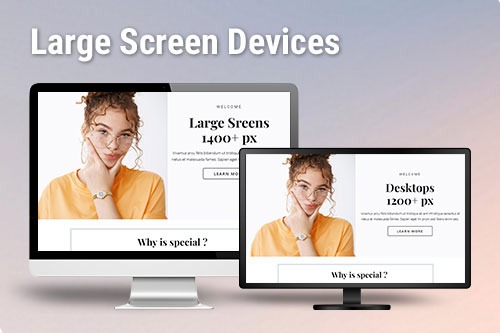
Responsive web design has become an essential part of modern websites. Like any design process, many design planning and experiments are needed in designing with large screens. This feature enables you to display your layout on the screen sizes. When speaking of responsive web design, the designers or developers think immediately of the smartphone, tablet, and laptop websites. The large monitors use responsible layouts, which enables you to fit your layout to the large screens. You can switch to the large screen from the top bar, and your responsive layout can see users on different devices. Similar to the WordPress themes plugins, this feature you can use in your web design (most of the websites aren't responsive).
When people talk a lot about this way of responsive web design, most developers say it's a perfect solution to the problem of screen resolution, and that's one of the biggest things about today with everyone on mobile devices. The larger viewing distance from the screen is maybe two to five feet for television, while the user of a large desk PC still sits in front of the desk. The large screen offers a wealth of layout space, and you can use that space with more features, more detail, or more content at a glance. On larger screens, the shortcuts will also be directly available on the home page. A simple realization assumes an elastic method in which all margins, indents, font sizes, and other settings are in relationship to the changed default font size ( with em or rem units).
To improve the user experience, the responsive design covers the entire range of options from mobile to desktop. Leveraging extra screen space to ensure this is one of the numerous "responsive scaling" concepts for e-commerce websites to consider. Too much side-by-side content will make the pages crowded and scrolling uncomfortable, and the addition of too much white space may cause the layout to be too sparse. Fluid layouts extend to the whole screen width while always utilizing the maximum current size of the preview area. Nevertheless, a well-thought-out layout can effectively use extra screen real estate UX design. There is no need to use media queries. You can fit your design to the large screens with just one click.