Cómo usar el elemento Control deslizante de ancho completo en el diseño web
Todo lo que necesita para crear su sitio web gratuito
Utilice nuestro Creador de sitios web para diseñar y crear sitios web sin codificación. Arrastra y suelta lo que quieras, en el lugar que quieras. El Creador de sitios web adapta automáticamente su sitio web para dispositivos móviles para que sea receptivo. Elija entre más de 15,000 plantillas de sitios web personalizables.
Funciones relacionadas
Plantillas gratuitas con Elemento deslizante
Comience con nuestras mejores plantillas, ideales para cualquier negocio. Créelos y personalícelos con nuestro potente y gratuito creador de sitios web sin código. Todas las plantillas son compatibles con dispositivos móviles y se ven excelentes en cualquier dispositivo.


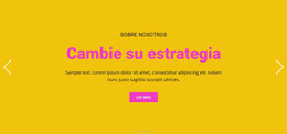
How To Create Your Free Full Width Slider Site
How to create a website, a WordPress theme or a new custom site template with your own best full width slider examples that will reflect the dynamics and your unique approach to your customers and visitors? First, you must discover how to add a full-width responsive element to build a layout with the free full-width online plugin. Quickly creating your full width slider is easy if you use our program and our site provides free download so that you can start at any moment.
After downloading, start the new site and click on the element tab, where you will find the fullwidth slider. Our best free web builder can set up your full width slider or image slider using the most relevant plugins. This builder with a full width slider using an image slider module provides multiple settings for slider design after you pick it. Set up the full width slider, and make sure to look through the settings in the right panel to customize the font size and style of the text and fit your fullwidth slider design into the overall website design. Other elements like skip to content and terms of service will be automatically placed above no matter what slide is currently on the screen. The fullwidth slider will support any resolution, whether on the phone or the latest monitor.
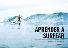
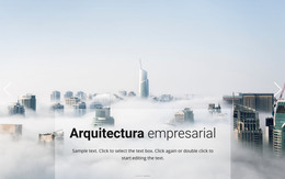
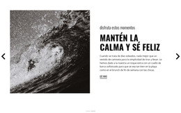
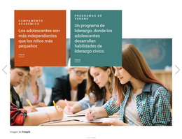
It is a good idea to pick several similar slides to promote the main theme with an image slider of your sites like real estate, food & restaurants, or sports. You can make a full width slider the distinguishing feature of your future websites if you discover how to add custom high-resolution images and unique fonts, which you can save as presets in your library. Tutorials with image slider module presented on our site will help you to realize the full potential of the full width slider element, as well as many others.