Contact us block with a map on background Template


A Map-Led Contact Design With One Focused Information Card
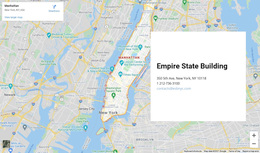
The strongest reason to choose this section design is its combination of geographic presence and concentrated contact information. A full-width interactive map fills the background, so the section immediately communicates location through imagery and map context. Over it, the white card creates a stable reading surface for the Empire State Building heading, displayed address, telephone number, and email address. This is more visually specific than a conventional contact panel that relies only on text and empty space.
The right-side placement gives the card a distinct role without dividing the whole section into equal columns. The map remains the broad visual field, while the card acts as the practical reference point. Its black heading and smaller gray details create a simple hierarchy that supports quick scanning: visitors can identify the venue first, then find the address and direct contact channels. The design therefore suits a page that needs location information to remain prominent without making the entire section text-heavy.
Among contact-section alternatives, this option is useful when the visual setting matters as much as the written details. It covers one clear purpose, uses a strong contrast between map and card, and keeps the contact content grouped in a compact overlay. The block offers a recognizable location composition rather than a generic form or isolated address list.
Customize with Nicepage
Open this ready-made template in the Template Builder and customize it visually in the Nicepage editor. Replace demo content, edit page sections, and adapt the design to your project without rebuilding the template from scratch.
Edit Template Offline
2. Create a new page or select existing
3. Click Add new block, search for id 42426 and click enter
Edit Template Online
Create Awesome Websites


Free Nicepage Builder
Keywords
Start With a Ready-Made Template
Choose a Design for a New Page
Use a ready-made template as a starting point instead of creating every page from a blank canvas. When adding a new page in Nicepage, browse available designs, compare different layouts, and choose an option that already fits the general purpose and visual direction of your project.
Browse Different Page Designs
Explore Page Designs using search, thematic categories, Design Sets, and full-page previews. The collection includes layouts for different subjects and page purposes, making it easier to compare alternatives before selecting a design to customize.
Customize the Selected Template
After choosing a design, create the page and continue editing it visually in Nicepage. Replace the demo content, adjust images, typography, colors, sections, and other elements, and adapt the ready-made layout to your own content instead of rebuilding the design from the beginning.
Explore More Design Directions
If the first option does not match your project closely enough, return to the design collection and compare other templates before committing to a layout. This makes the template library useful not only for faster page creation, but also for exploring different visual approaches and finding a suitable starting point for a new project.
This workflow gives you access to a broad collection of ready-made designs that can be selected, compared, and customized according to the needs of each new page or project.